WEB DESIGN + DATA VISUALIZATION
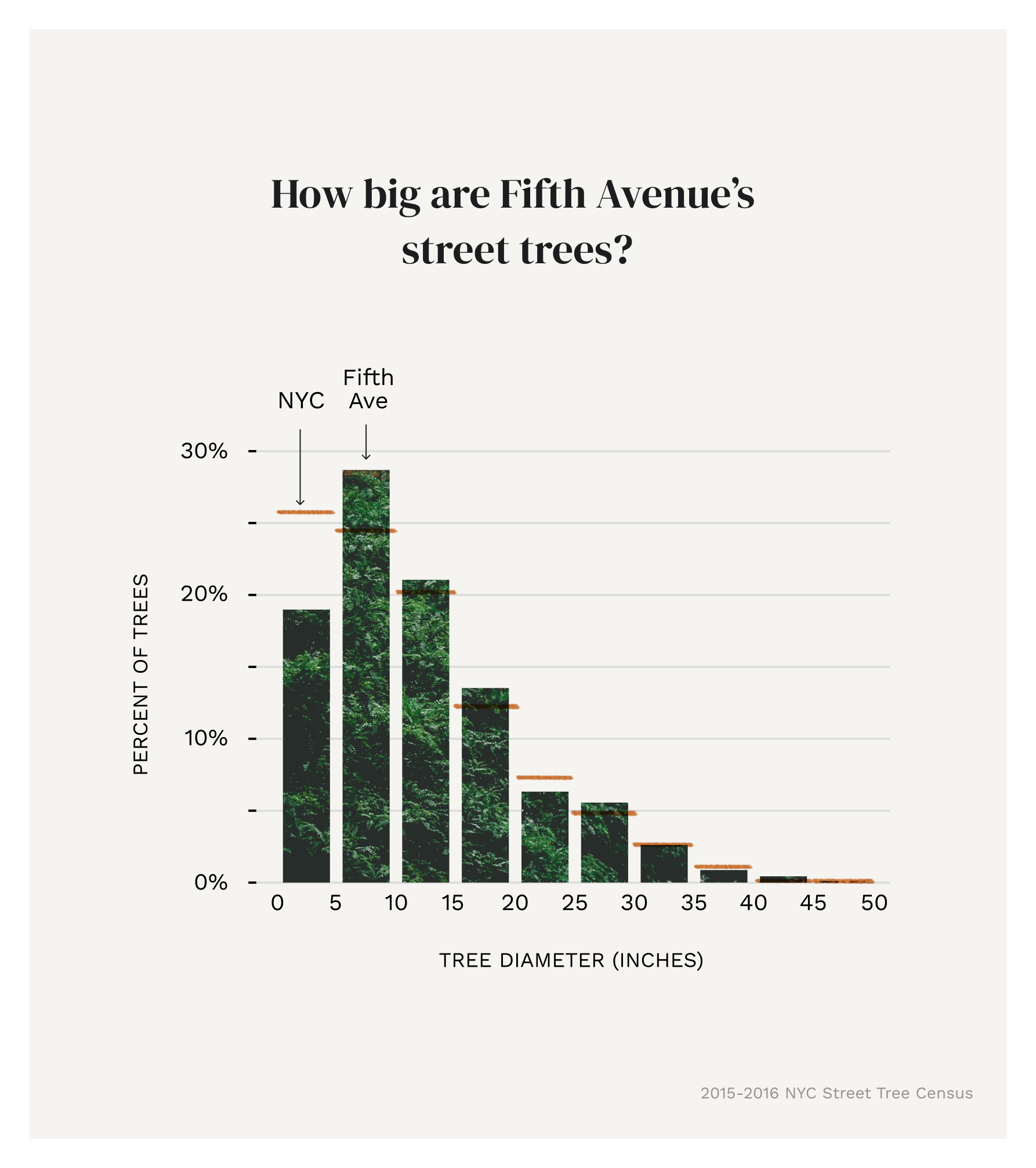
A walk down Fifth Avenue
Created as part of my master’s capstone (with a topic and data set of my choosing), this website highlights the visible data (physical characteristics) and invisible data (ecological benefits) of New York City’s street trees, focusing on a well-known stretch: Fifth Avenue. The site includes pages for each of the following: the map, the visible data, the invisible data, and a draw-your-own worksheet. This project received the grad program’s capstone award.
Created for graduate capstone (MPS, Data Analytics and Visualization from MICA), 2022


What symbols do people associate with each of the categories I wanted to show?
User testing
Visually encoding 8+ categories of data into a single pictograph was a fun challenge. I initially sketched out a few proofs of concept, testing out different ways to show and organize items. I knew user testing would be important to get this right, so I conducted moderated sessions with 15 people with various backgrounds.
Below are the categories that I focused on:
Physical characteristics:
Type (species)
Size (diameter)
Health (good, fair, poor)
Problems (roots, trunk, branches)
Status (alive vs. dead)
Ecological benefits (annually):
Stormwater intercepted (gallons)
Energy conserved (kilowatt hours)
Carbon dioxide reduced (tonnes)
Pollutants removed (pounds)
I created a list of abstract symbols for participants to choose from for each of the categories. The test consisted of a matching/association game, where the participant selected their first and second choices of visual representations for each of the categories. After each selection, I asked them why they made their choice, in order to get additional insight. I used a Miro board for the matching game, and shared my screen over Zoom for the interviews. Below is the structure I used, and what it looked like before and after an interview:
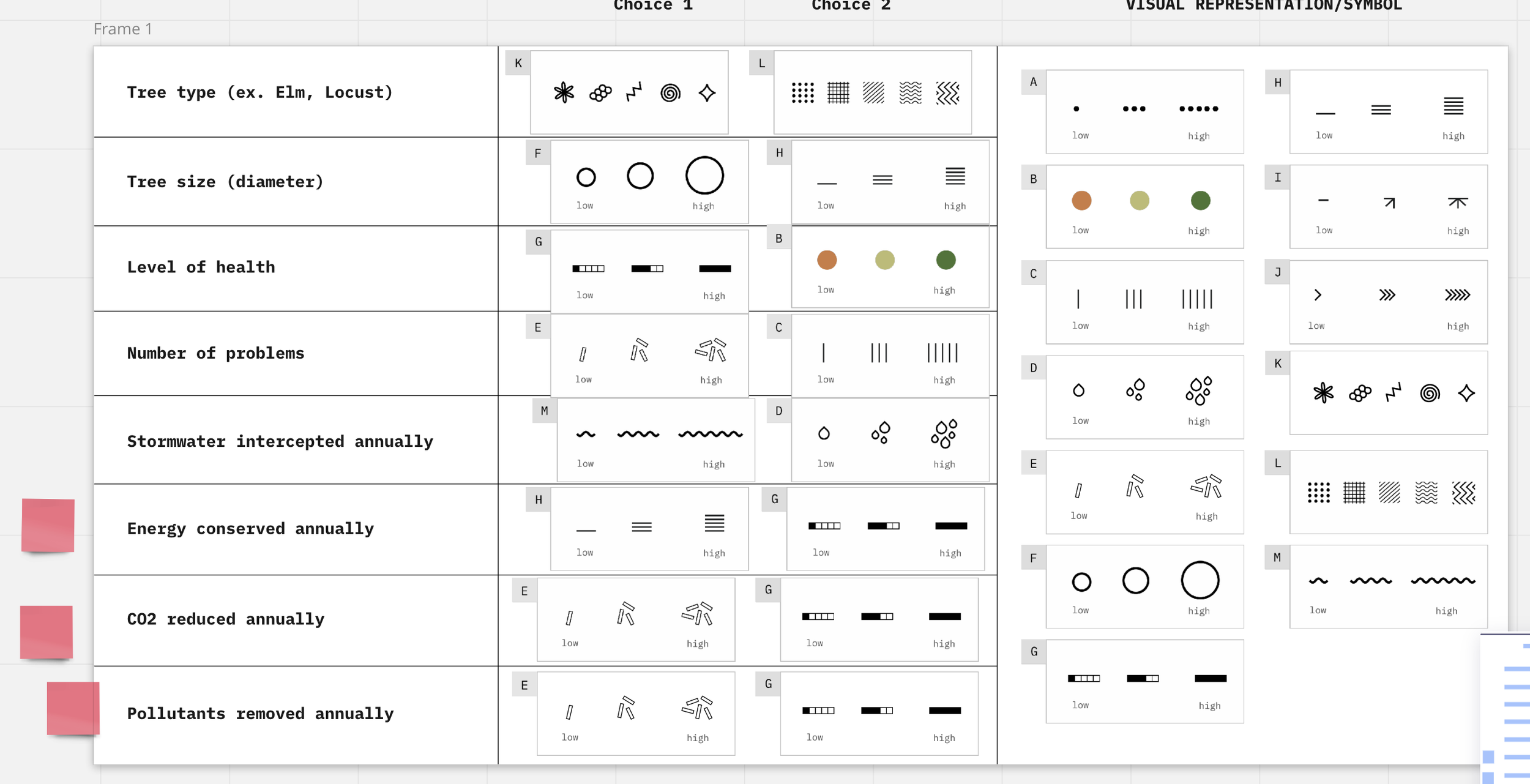
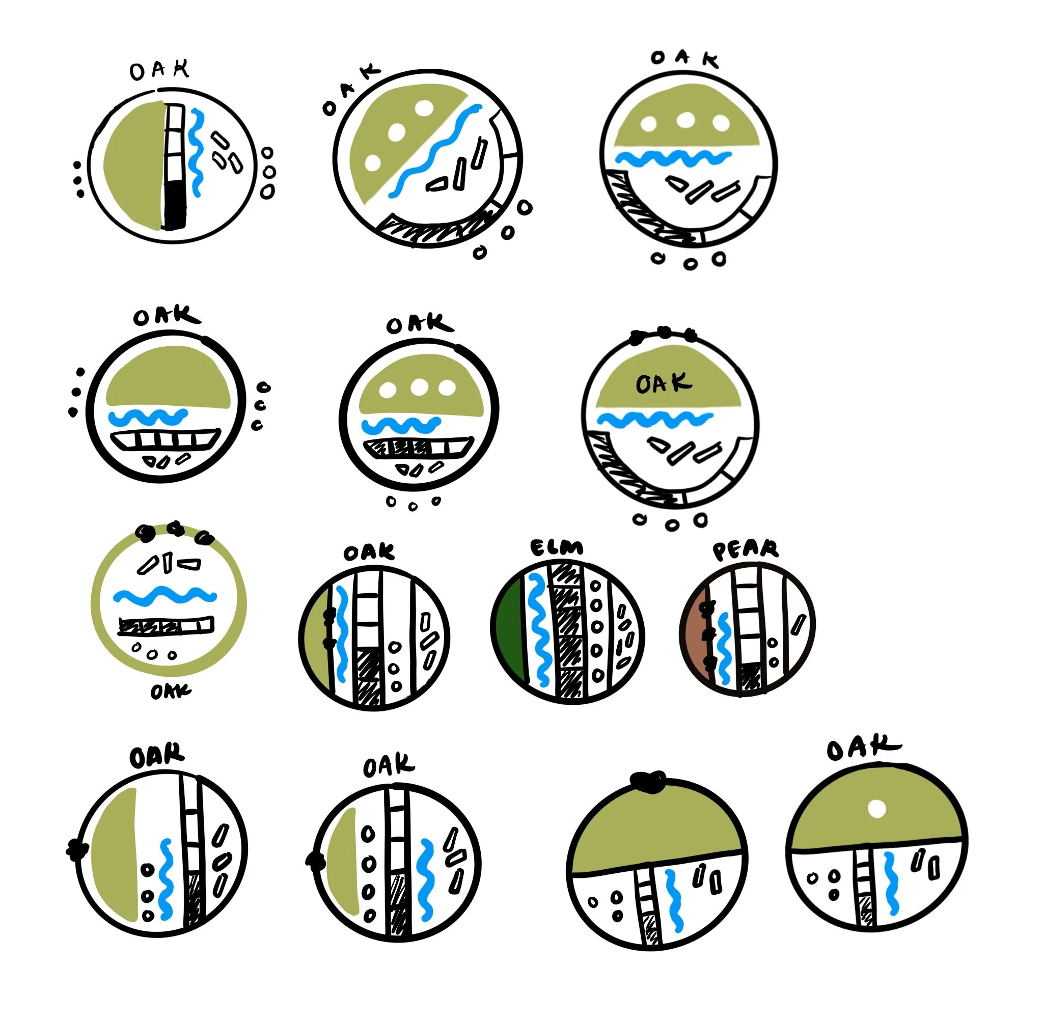
After synthesizing the data, the results were clear. Below are the symbols that would would be used for each category. I began playing with different ways of arranging these, and then brought them back to people for user testing, before ultimately deciding on a vertical grid structure for easier recall.


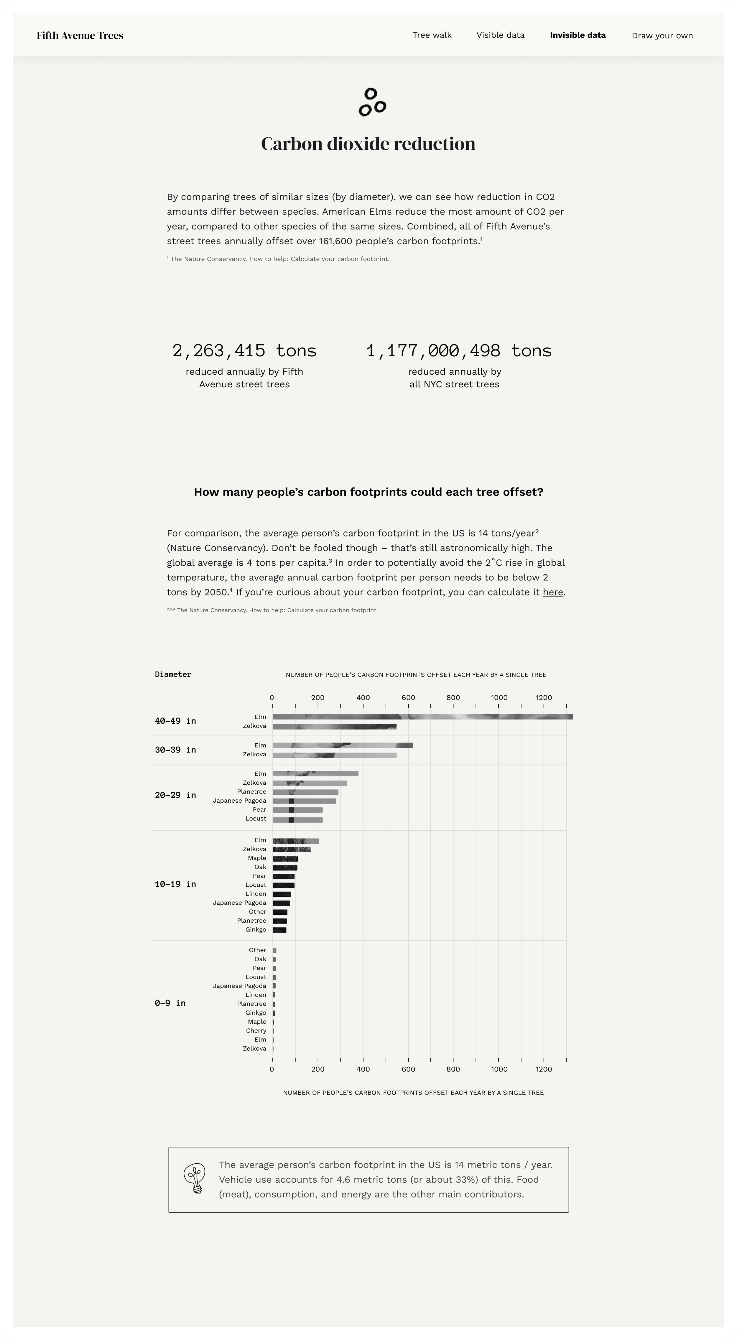
For the graduated symbols (stormwater, energy, CO2, and air pollutants) representing ecological benefits, I divided the data into cohorts and mapped them to the five levels of each of the symbols. Each tree type was compared to trees of similar size.
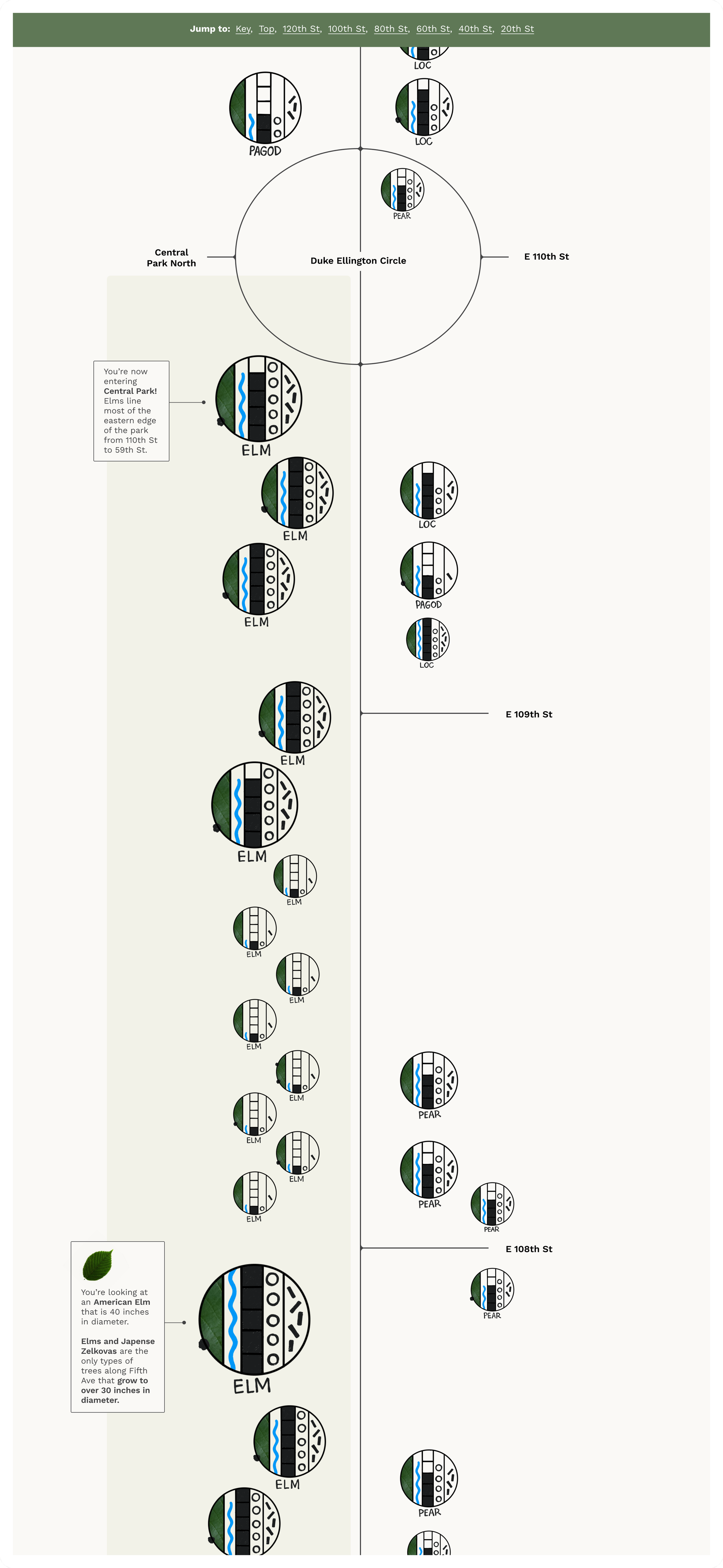
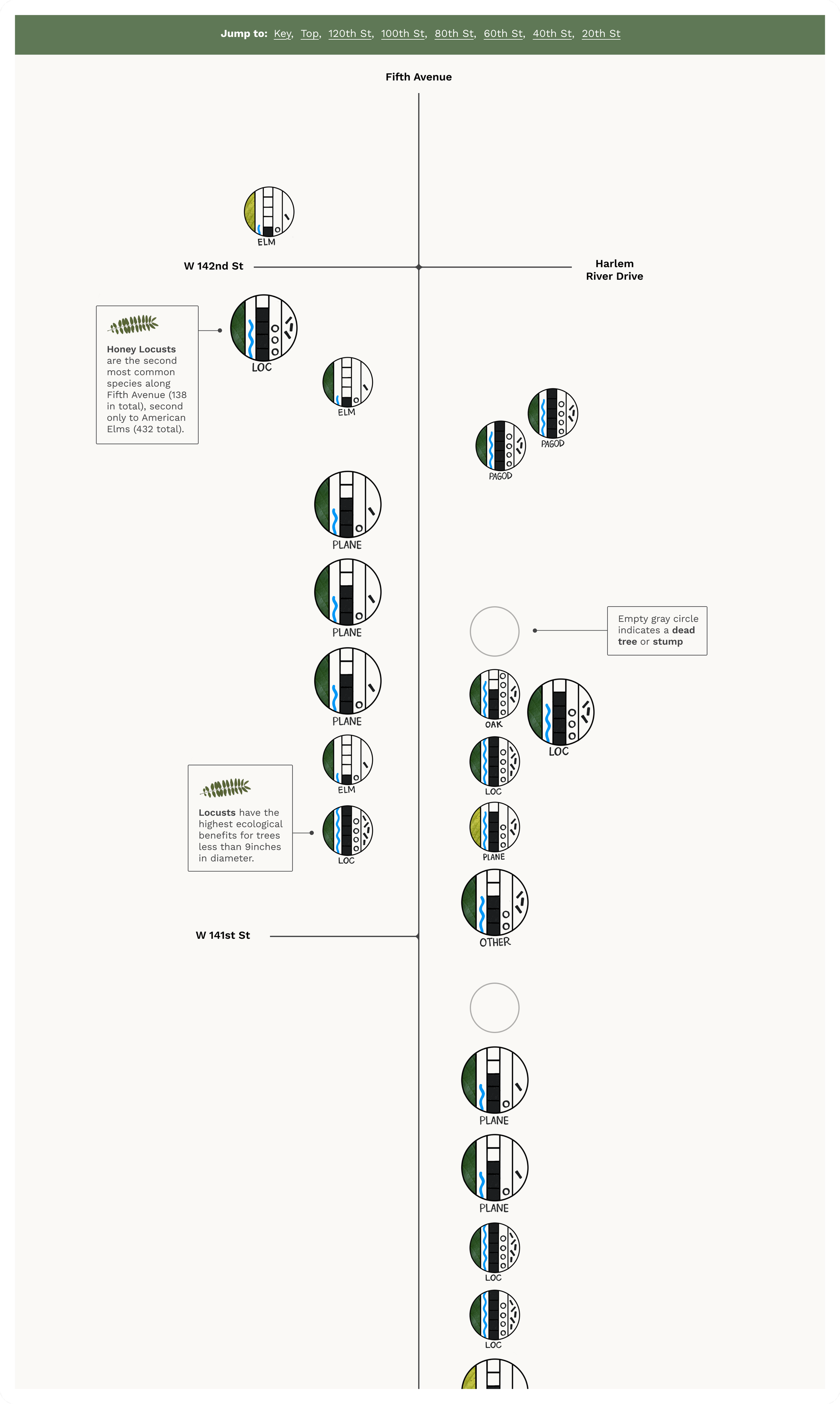
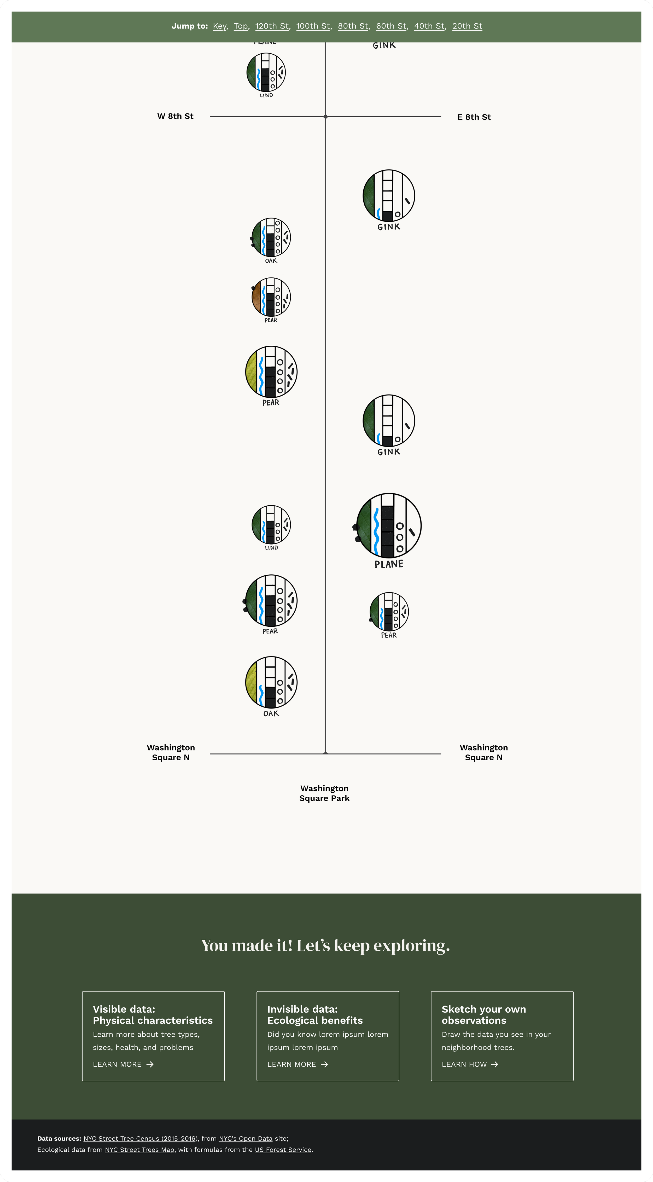
Squishing six miles of trees into a unique, scrollable map
At first I considered showing them in one big grid, but so much context would have been lost. I wanted the map to resemble a map, but stripped down to only necessary context (eg. intersecting streets, major landmarks). There also needed to be sticky jump links, otherwise you would be trapped in an endless scroll. The home page gives context and a how-to-read before the map. Annotations were an important piece, as I wanted to ease viewers into the information, trying to not overload them but rather spark curiosity and help them interpret the charts.
View live page here.
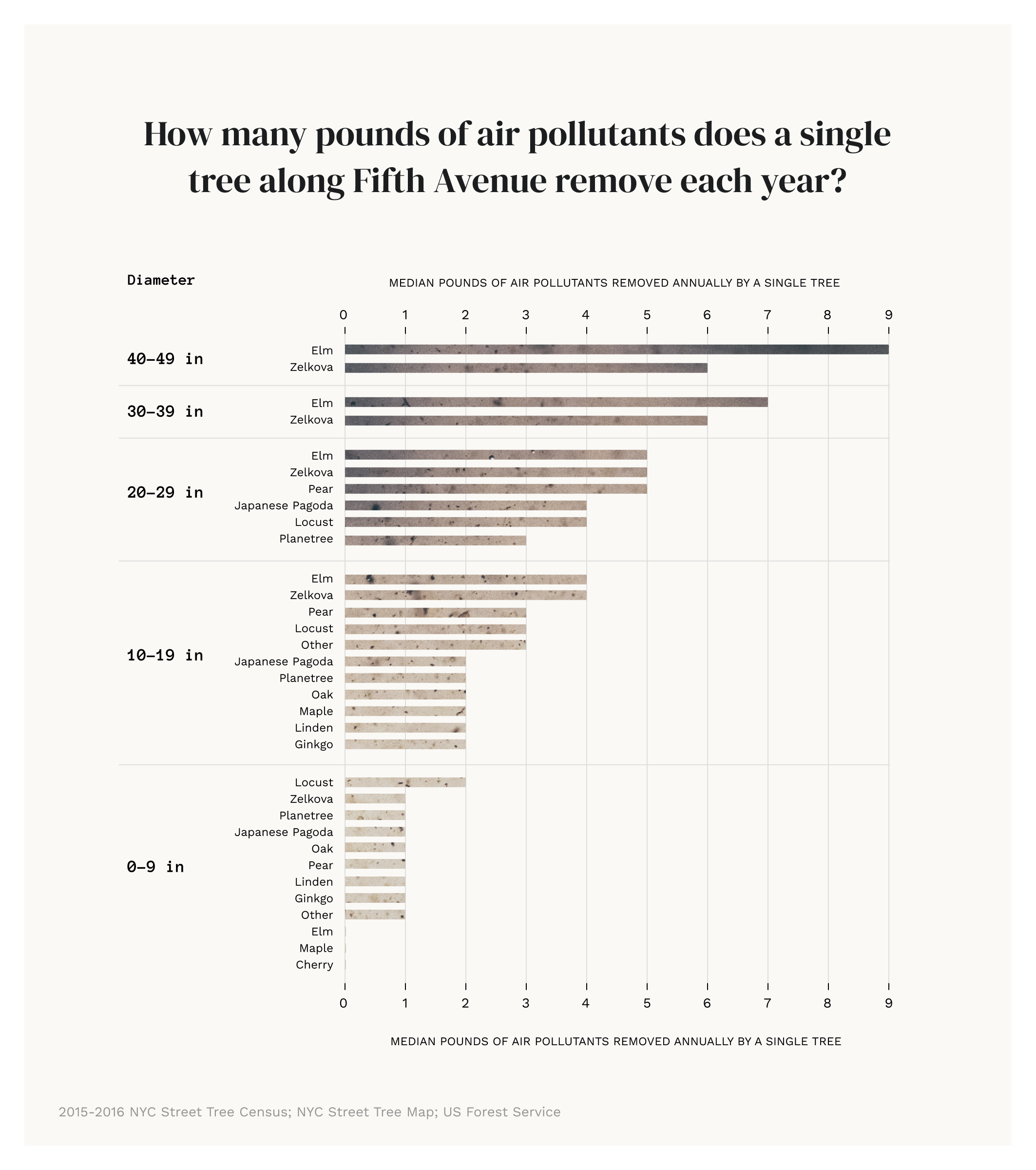
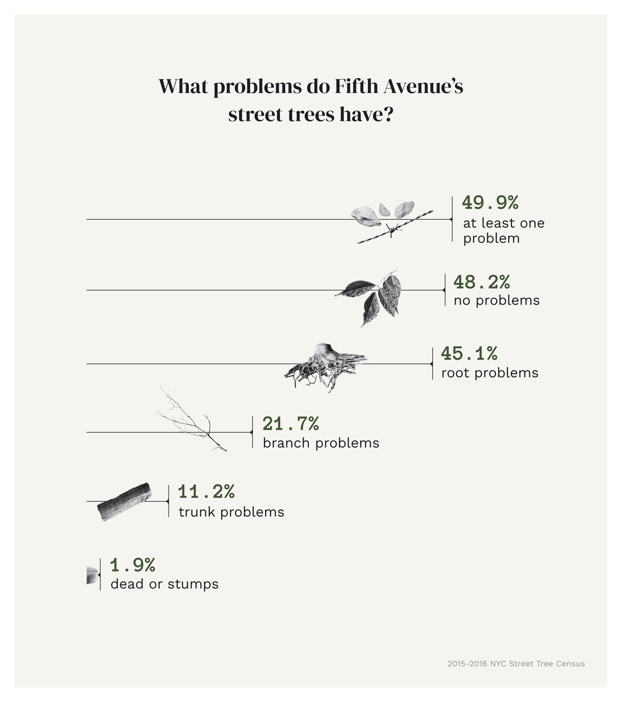
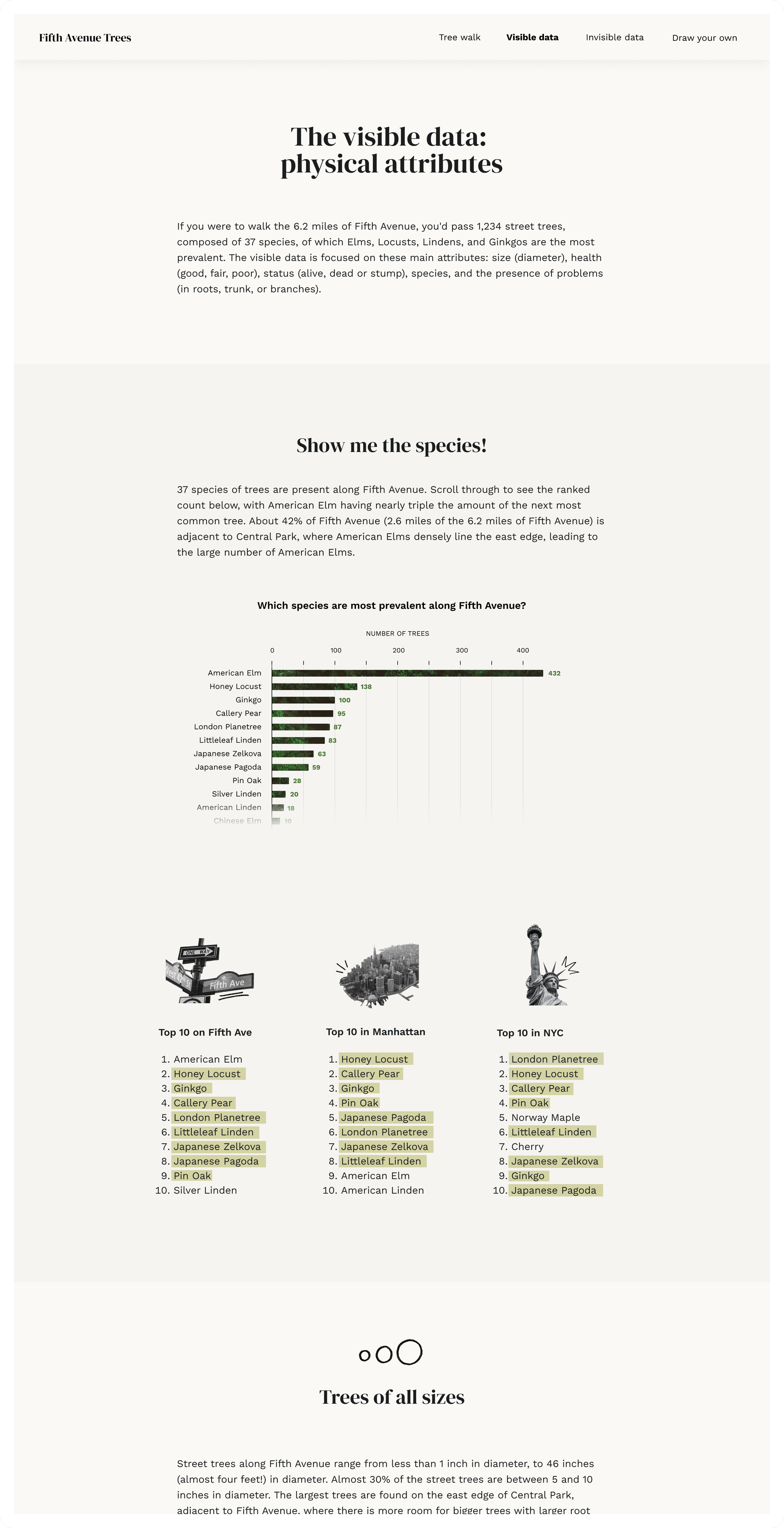
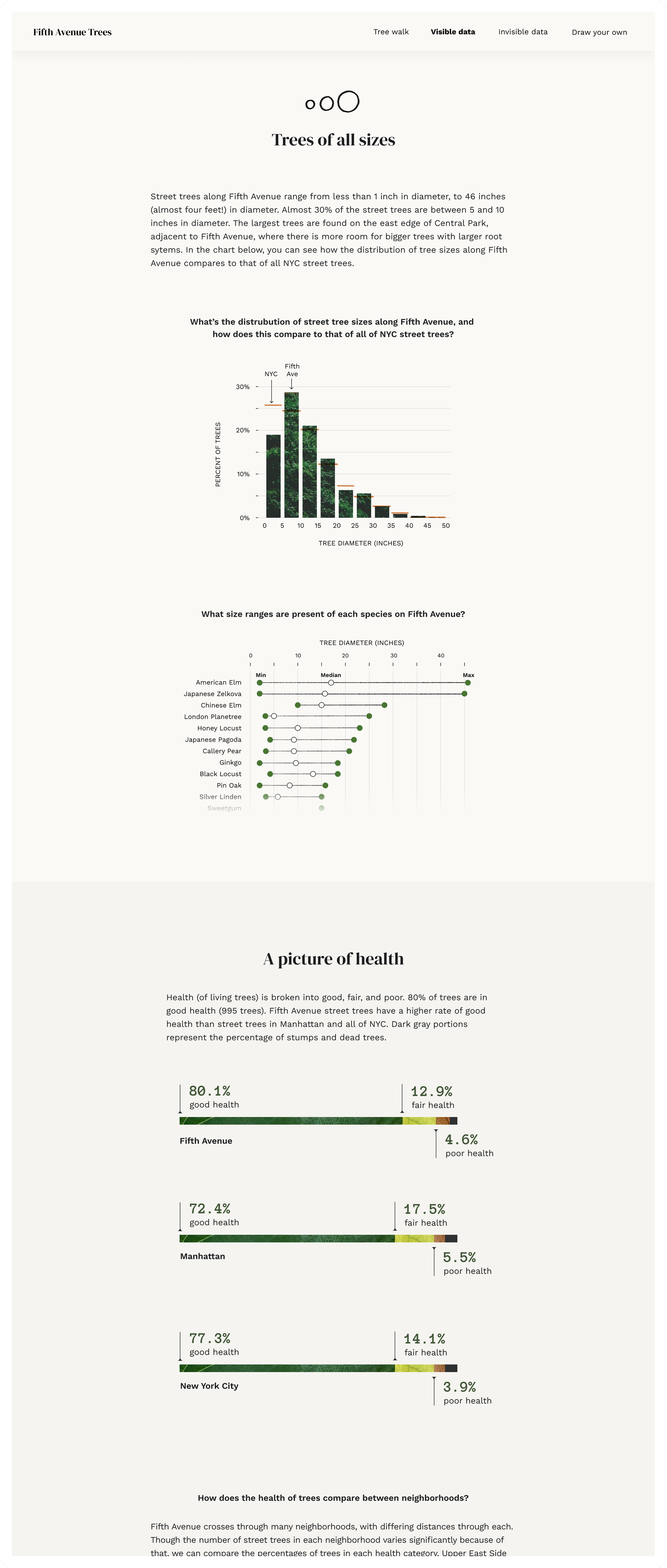
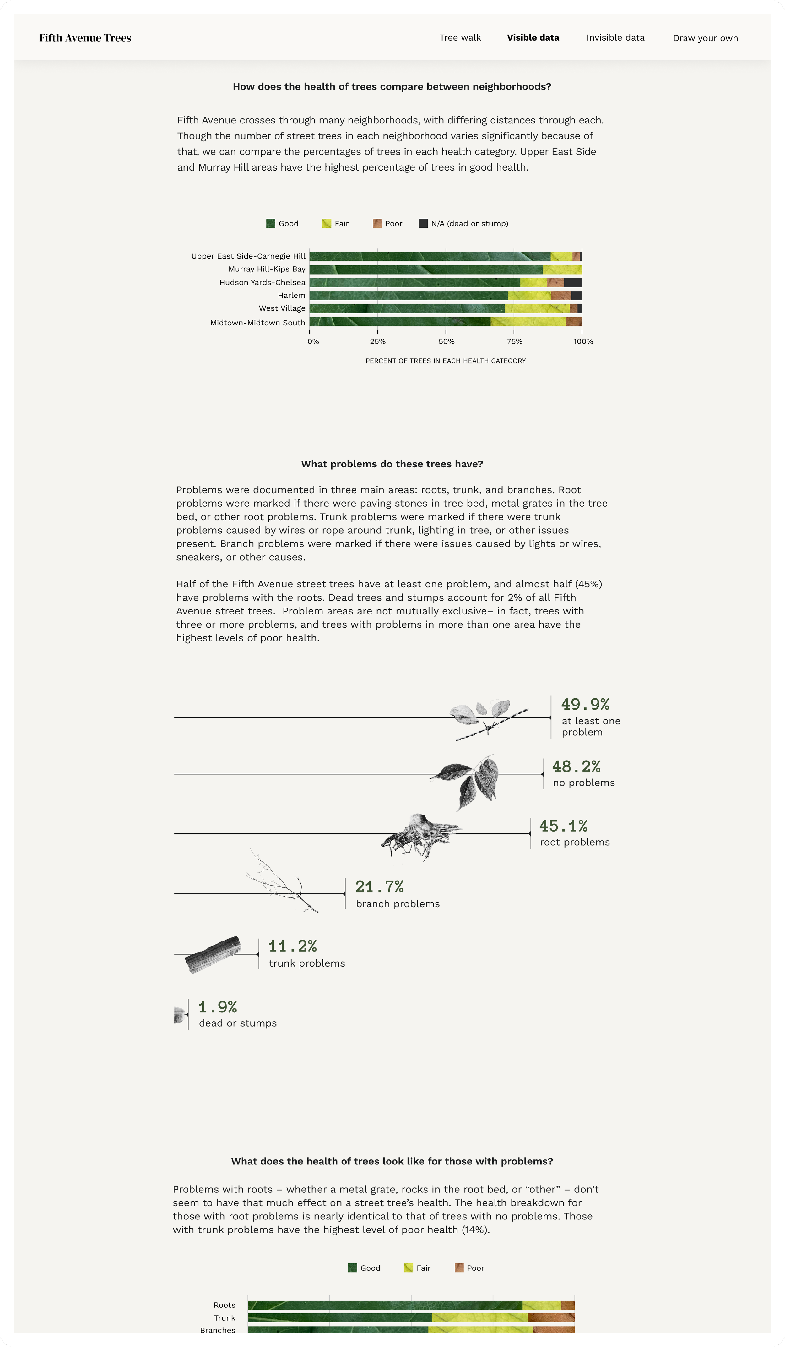
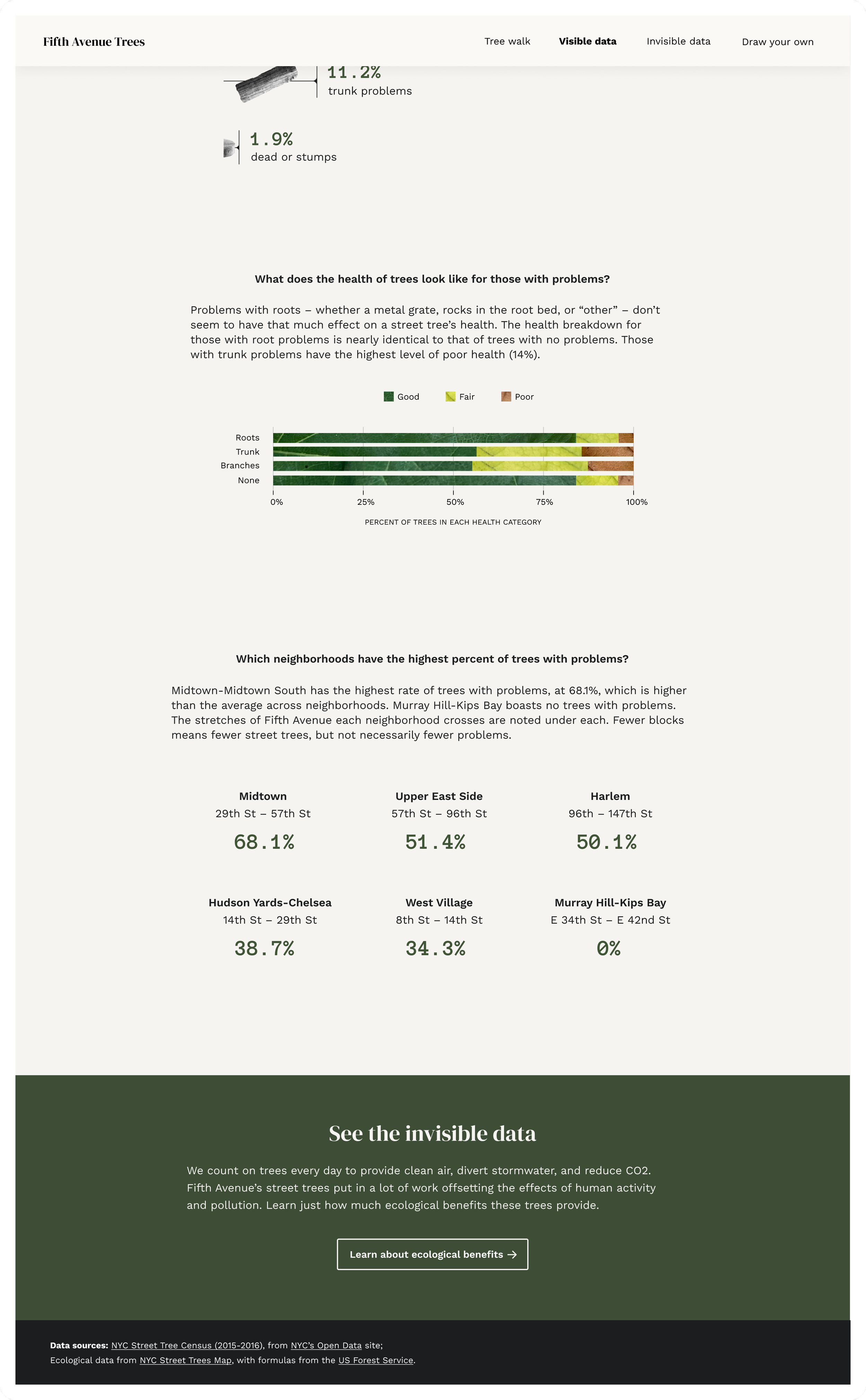
The data you can readily see: physical characteristics
The charts on the “visible data” page tell you about the trees’ species, size, health, and problems – not only for just Fifth Avenue but compared to both Manhattan and New York City. These charts were the most fun to make. How could I push myself to add personality and life into bar charts? For some of them, I decided to push the boundaries of what a bar chart was. I incorporated photography where possible – adding texture but not distraction – to tie back to the natural theme.
I went on a leaf hunt, and took pictures of different variations of leaves in different colors. These photos were used for the health indicator in both the tree pictographs and the stacked bars. I wanted to practice what I was preaching, making sure I too was engaging with my data and environment.
View live page here.
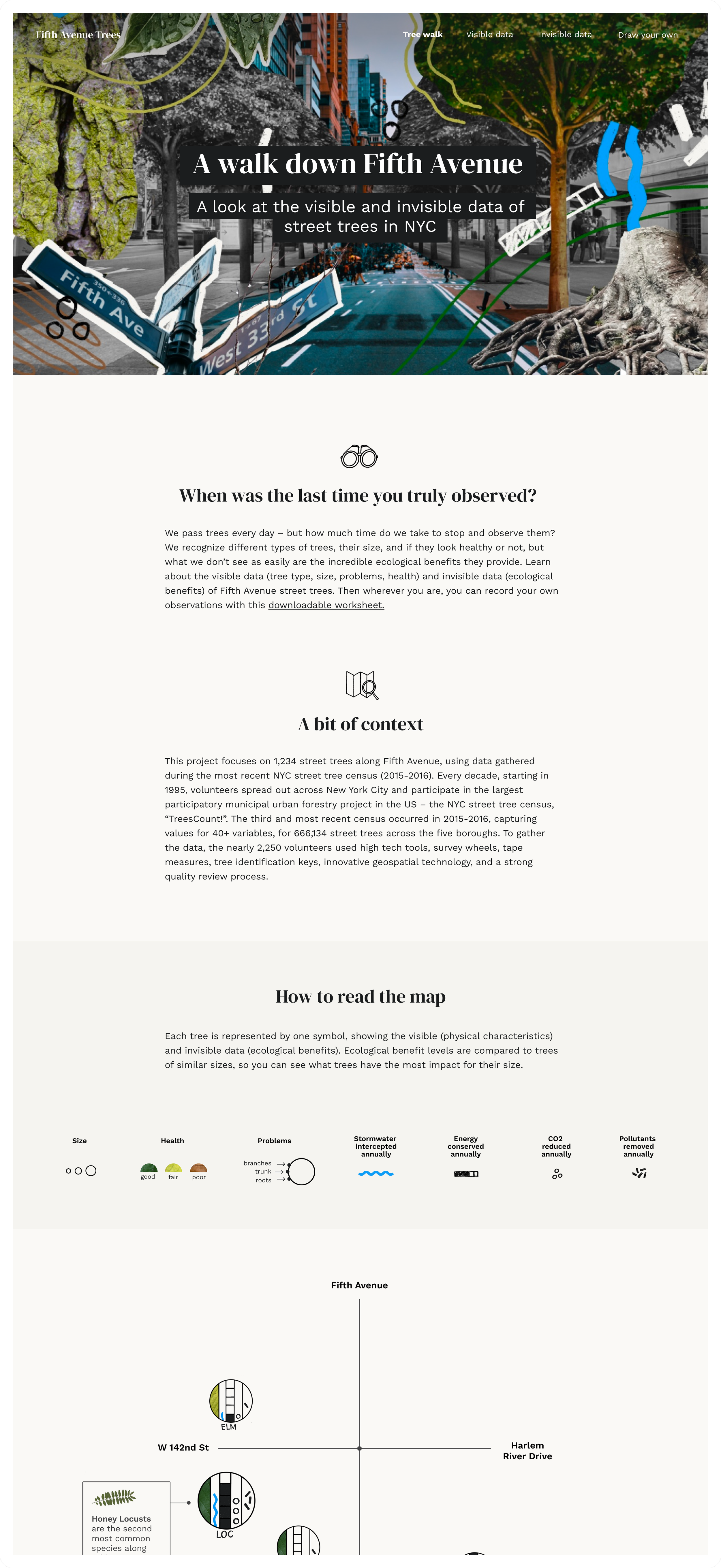
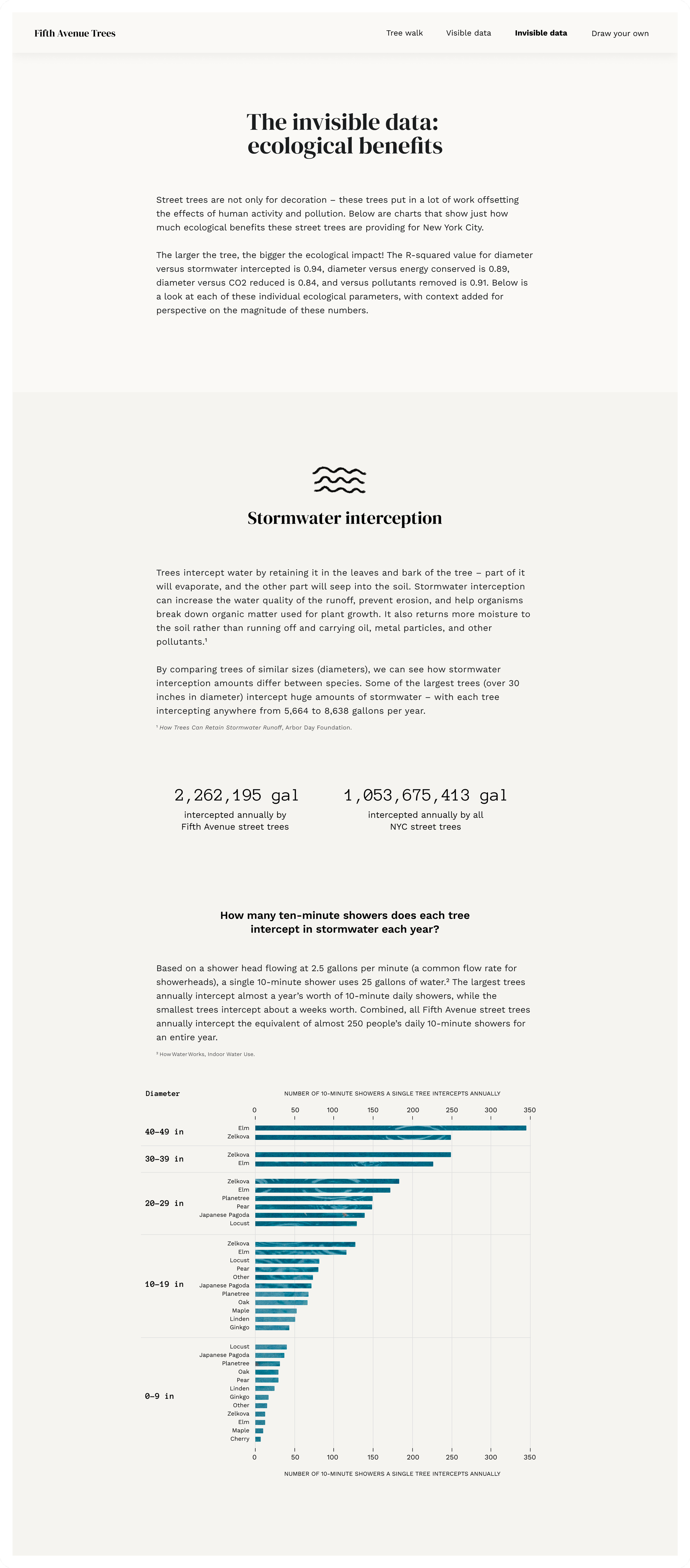
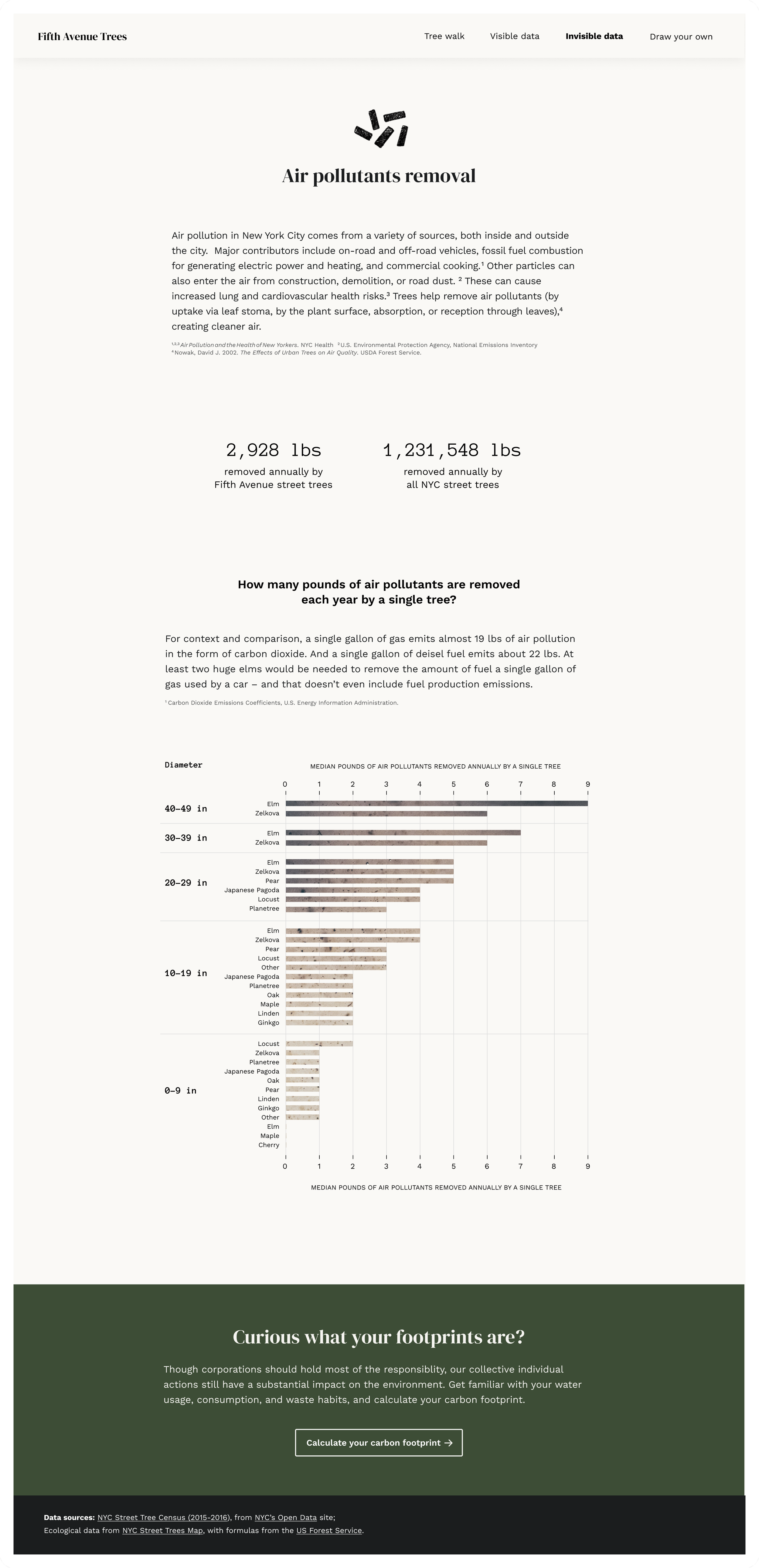
Trees are incredible. How can I show the magnitude of their impact?
As I was beginning to analyze the ecological data, one thing stood out: these numbers are so large and feel so abstract, that I have no idea what they are actually showing. With help from classmates, I landed on this: translating these numbers into things people are more familiar with, while also showing aggregate values to show the magnitude of tree’s impact. The takeaway I want people to get: trees put in a lot of work and do incredible things for our planet, but humans are doing massive amounts of damage to the earth that outweighs this.
For each of the sections, I used the signifying symbol to tie it back to the map, and used photography that further tied the chart to its subject matter. Each chart was broken up into diameter size cohorts (0-9 in, 10-19in, … 40-49 in), so that trees of like size would be compared to one another. Otherwise, a huge Oak (for example) would seem to overshadow all the benefits a small Ginko is providing.
View live page here.

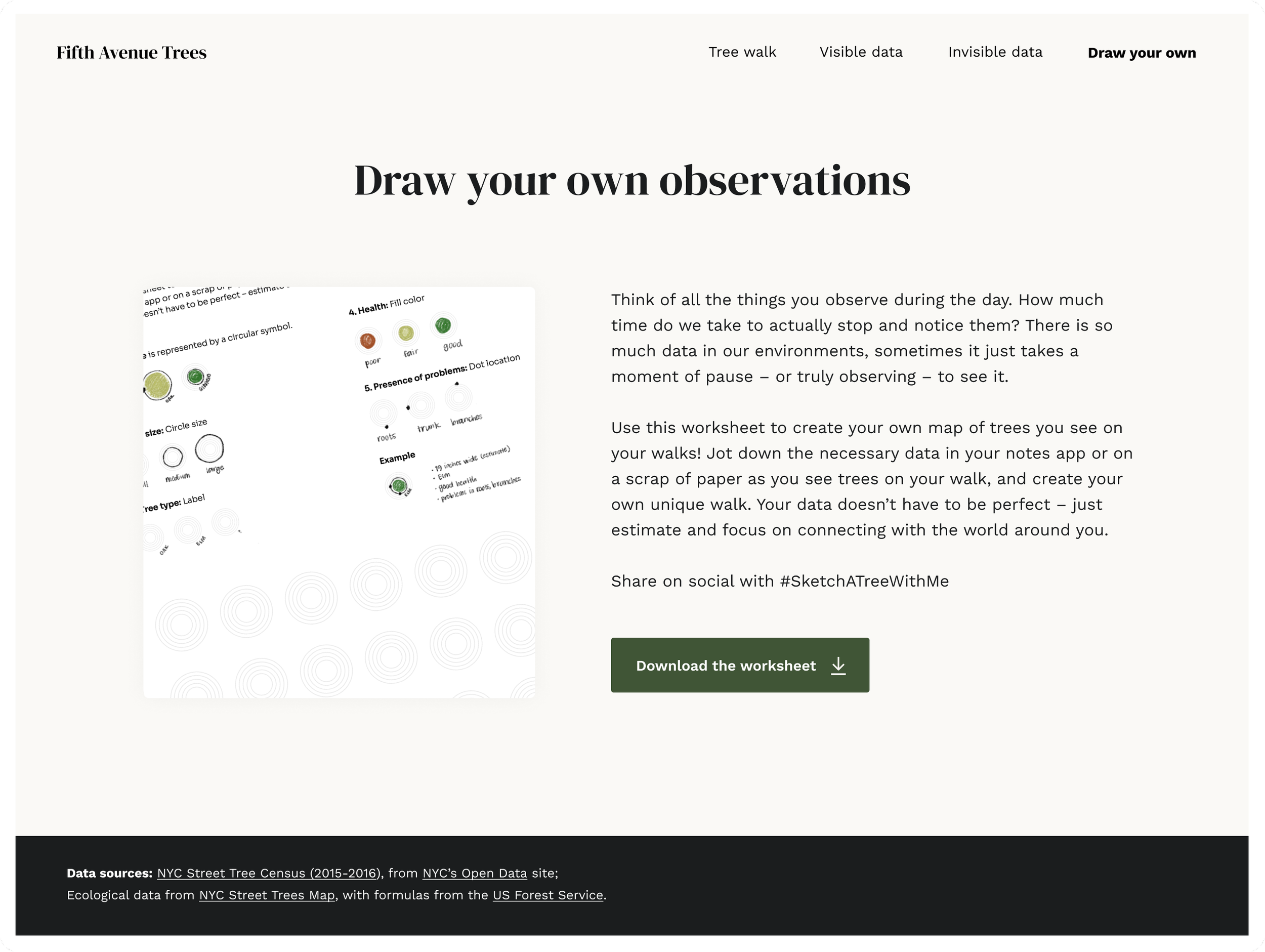
Your turn! Drawing your own tree observations
To encourage curiosity and interaction with your environment, I created a worksheet for people to draw their own tree observations. This was heavily inspired by Dear Data, and the corresponding Observe, Collect, Draw! workbook. Because I wanted this exercise to be more approachable and less involved (i.e. data one could quickly jot down in their notes app), I decided to omit the ecological data, and rework the symbol to be something that could very easily be filled out.
View live page here.