DATA VISUALIZATION
Commuter trends from 1970-2019
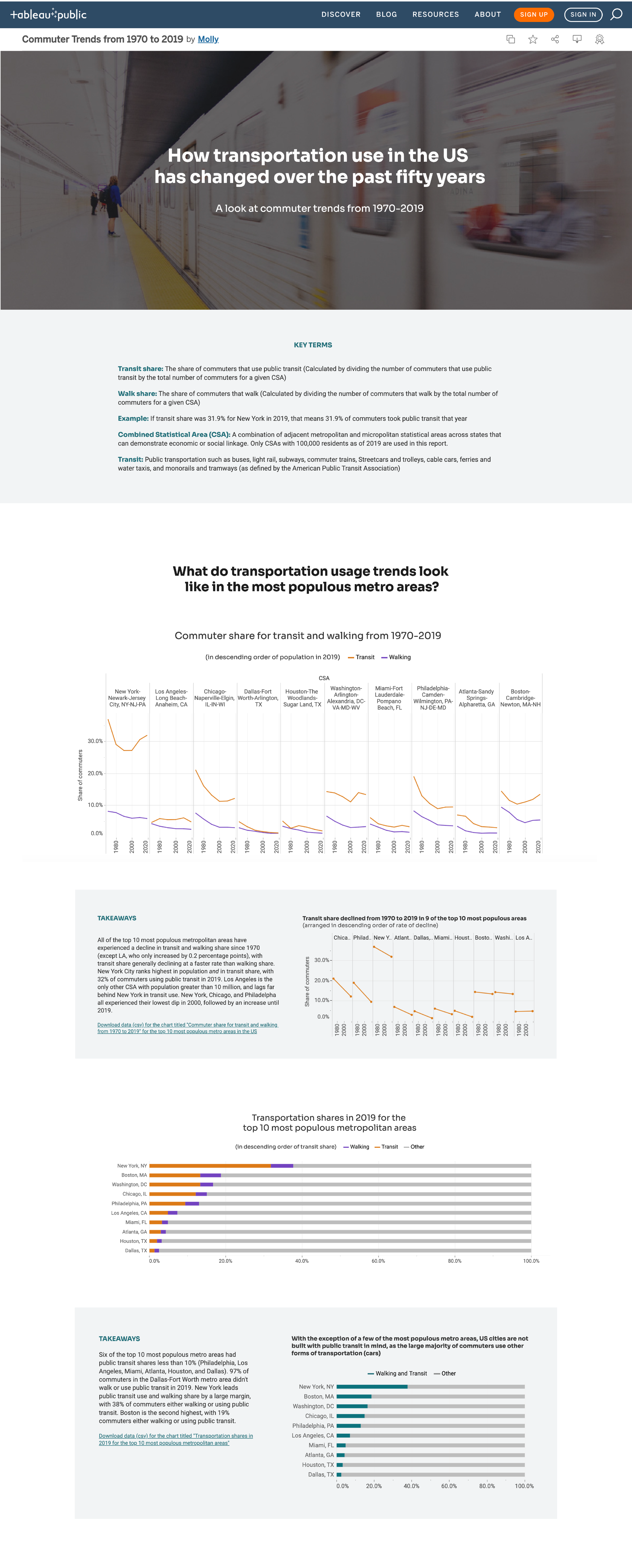
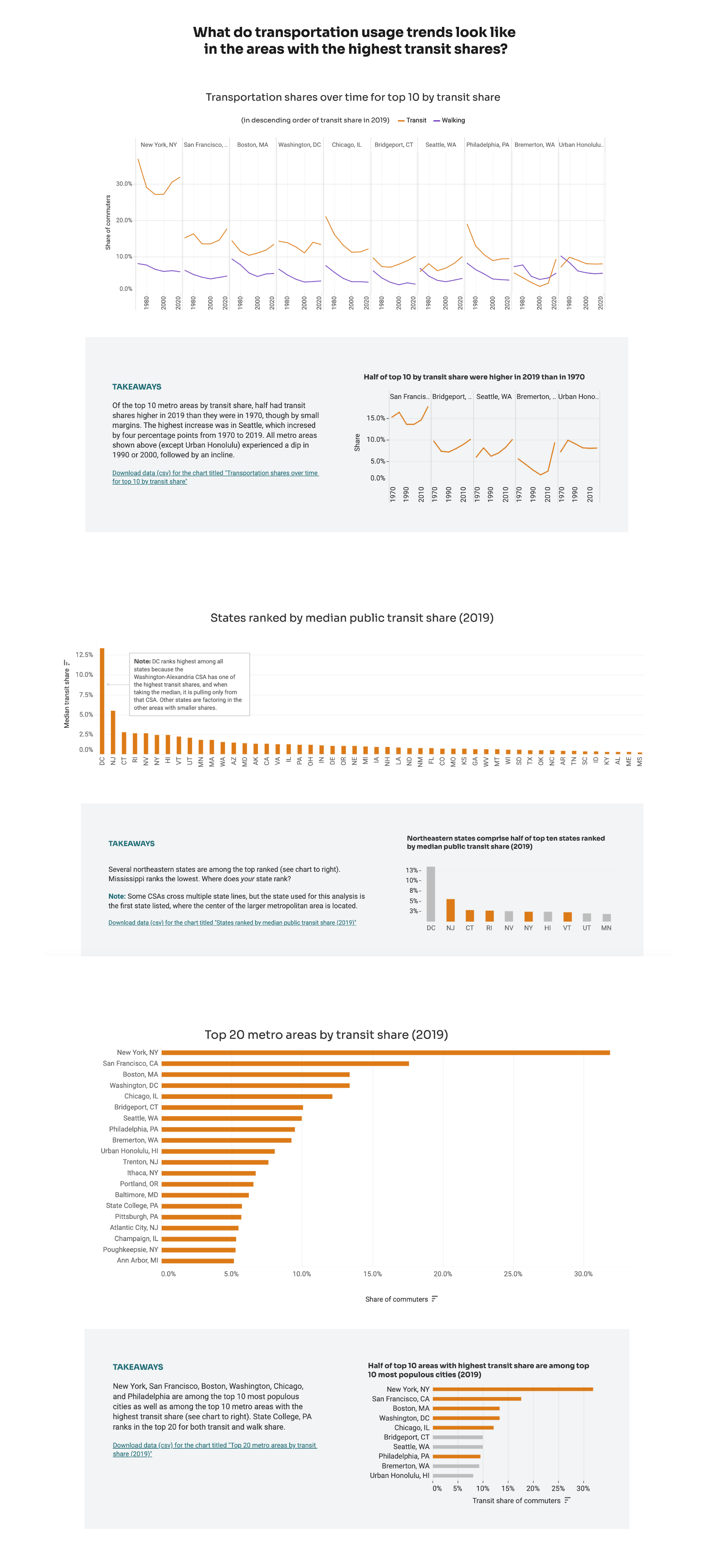
Using a data set from the Urban Institute, I analyzed commuter trends from 1970 to 2019, looking at walking share and transit share, to see what metro areas had the highest use of public transit and how it has changed over time. Initial data cleaning and organizing was done in R, then the tidy data was brought into Tableau for visualization. Static images of graphs are replicated below, but to see tooltips, key takeaways, and interact with the charts, view the project on Tableau Public.
Created for during graduate program (MPS, Data Analytics and Visualization from MICA), 2021
A mixture of exploratory and explanatory data viz
Challenge
Choose a data set from Urban Institute, and create either an exploratory or explanatory data visualization with any tool you choose, using at least four charts to tell the story. I chose a data set that detailed commuter trends in the US from 1970 to 2019. Looking at walking share and transit share, the project focuses on what metro areas had the highest use of public transit during this period, what transit use looks like in the US’s most populous cities, and allows you to explore transit use where you live.
Process
Initial data work
As with any data set I consider, the first thing I do is make a list of fields the data set contains, and map out what comparisons might be interesting to make, and what supplemental information I might need. This data set had been created from census data, but it needed more cleaning and organization to be able to pull into Tableau and make the charts I was considering. Bringing the data set into R, I cleaned and organized it into a tidy format, so that I could easily do analysis and chart it in any manner. Big thanks to the dplyr and tidyr packages. Here are some examples of what needed fixing:
CSA (Combined Statistical Area) included city and state and needed to be broken into two separate fields for city and state
Once broken into a state column, some CSAs were mapped to multiple states if they were near a state border, so their format could be anywhere from one to four state abbreviations strung together with hyphens (Ex. Philadelphia-Camden-Wilmington, PA-NJ-DE-MD)
The mode of transportation (walk or public transit) and the corresponding year were trapped in column headers (Ex. Transitshr1970, Transitwalkshr1970)
Much of the initial analysis was also done in R, looking at top metropolitan areas by share, and trends in the top 10 largest metro areas.
Layout, styling, and copy
I sketched wireframes, and created a mood board with colors, fonts, and images. I knew I wanted it to feel clean and not overly lean into the transit theme (ex. cheesy stoplight colors or mimicking subway designs too much). I wanted to ensure the colors were accessible in contrast and hue, and chose shades of purple, orange, and blue (two adjacent color and one contrasting). The colors also had to be easily differentiable at small sizes since there were to be several small line charts.
Copy was written and rewritten throughout the process, to ensure that the narrative and key takeaways were clear. I wanted to be sure to include contextual information since terms used were somewhat industry specific.
It is less of a dashboard and more of a web report or single-page microsite. I created the layout in Tableau, using panes to map out where I wanted the sections to go. While this was helpful, things auto-adjusted and shifted around many times, and the process became fairly tedious.
I wanted the final project to have the following attributes: trustworthy, approachable, bright, accessible, and human.
User testing and final polishes
After the page was stood up in Tableau, it went through a couple rounds of critiques with a variety of people: those familiar with transit data and those not, and those in the design field and those who aren’t. Some changes I made as a result of those user tests were making copy more clear, having a clearer key takeaway section, and highlighting specific portions of charts to emphasize the takeaway.
You can see how different the MVP was from the final product, seen in the key takeaway sections (shown below).
Bringing it into Tableau
Once the data was in tidy format, I was able to create all the charts I was hoping to. I wanted to focus on showing trends over time with small multiples, compare by walk and transit, and give people the ability to explore trends in their area. I knew I was going to need several charts to illustrate the narrative, and I created many charts in Tableau before selecting a subset of them.


The final published product
See screen captures below, or skip that and go straight to interacting with the final product on Tableau Public. Don’t forget to see trends for the metro area to which you’re closest!
(Hey Tableau, it’d be really nice if you could display the fonts I actually chose. Ugh.)