Product designer specializing in data analytics and visualization
With a focus on data communication, connected systems, and crafting beautiful experiences
I’m happiest when I’m learning, challenging myself, and creating in any form. I seek to find, share, and add beauty in the world around me. This may mean baking cakes and treats, taking pictures of silly clouds, illustrating, or bringing clarity to others. I thrive with ambiguity and difficult problems, and bring deep curiosity and care to everything I do.
I have a background in mathematics and in visual/brand design, and feel lucky to have carved out a career that I love blending the two.
January 2026, MAIA Analytics
Data communication and transparency
Sole designer
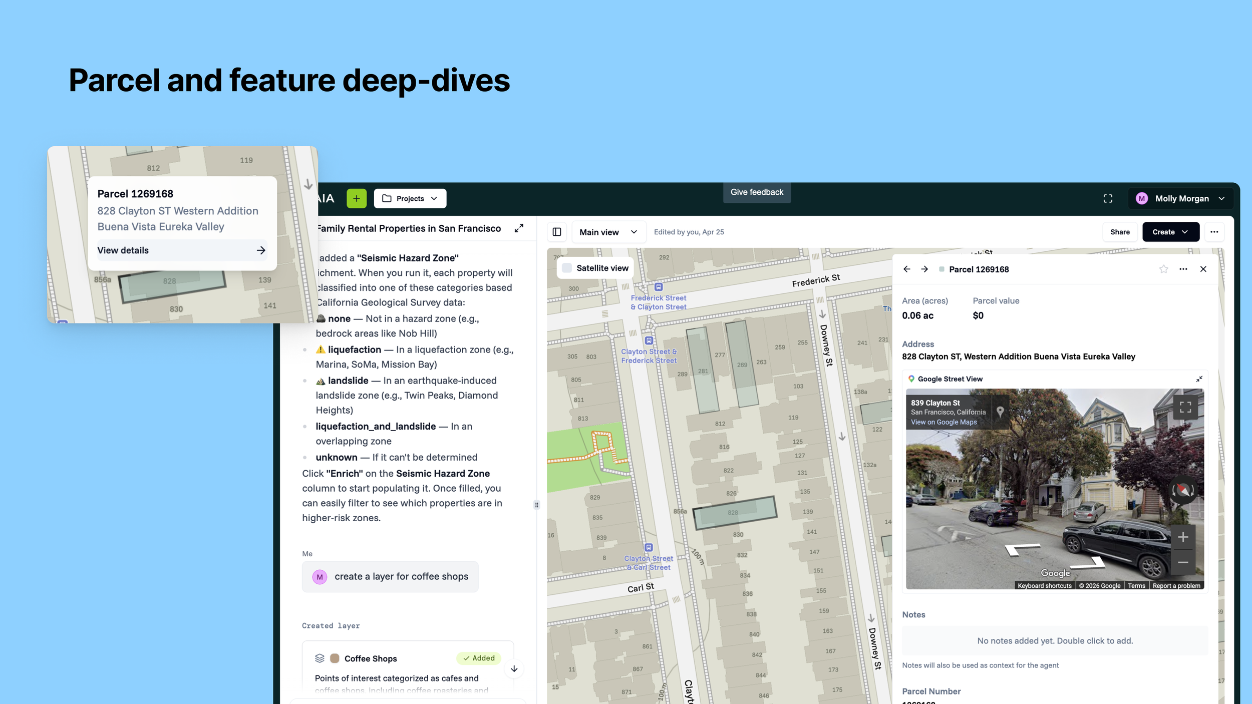
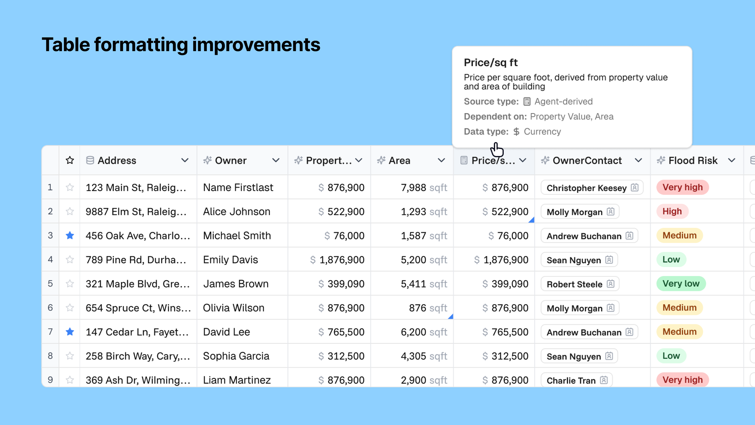
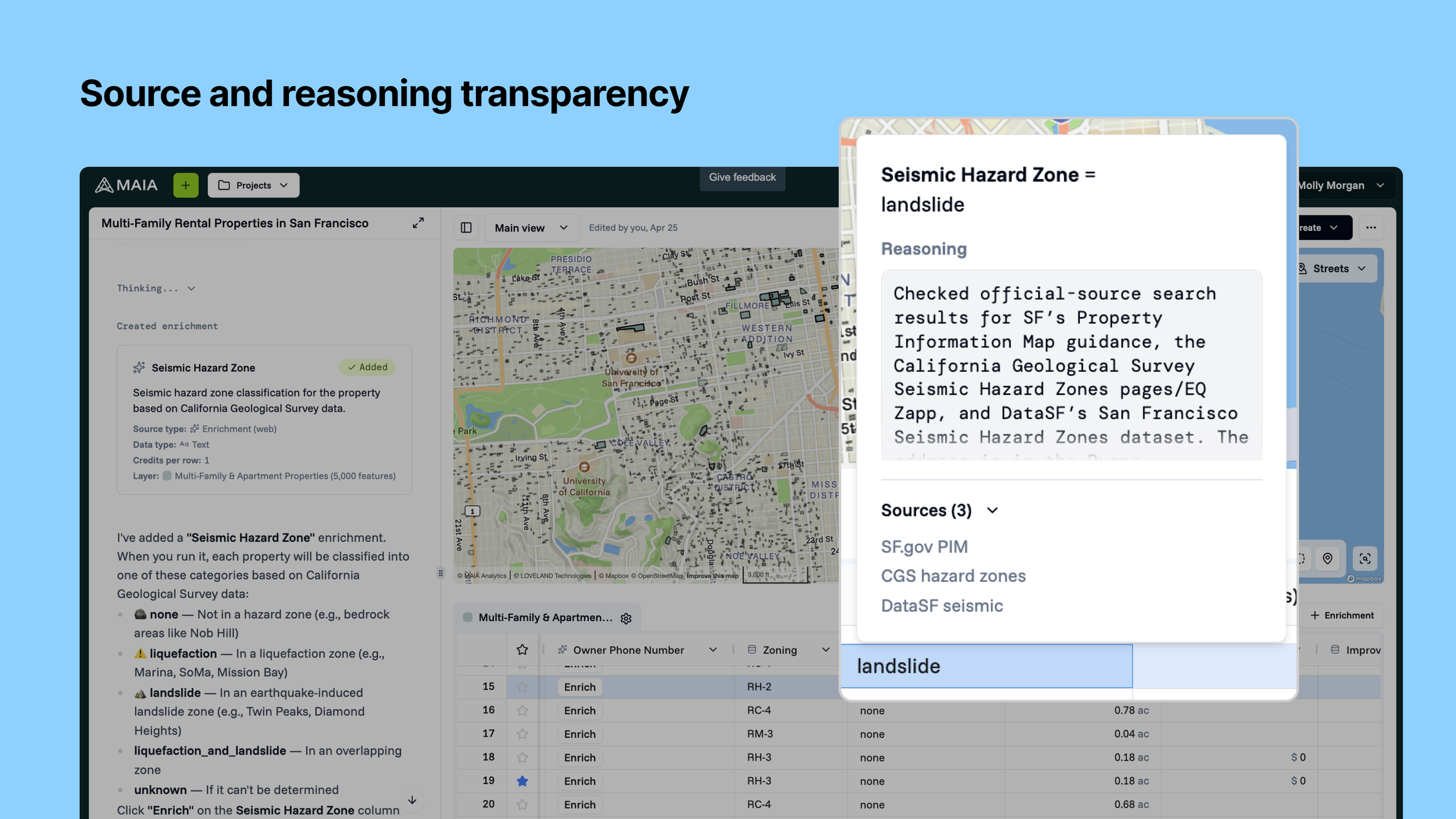
MAIA has three tiers of data currently: Base datasets, enrichments, and agent-derived data (calculated). In the near future, we will also have user-added data. Because of the breadth and depth of data, and the agent’s abilities to grab data through web searches and calculations, transparency is paramount. Data communication and transparency is critical for a user’s ability to trust and take action with the data. This includes understanding where the data is coming from, the agent’s reasoning that lead to the output, and how our system uses and builds its data model.
We have ongoing initiatives around data consumption, communication, and transparency. This problem space also evolves as our agent capabilities and base data sets evolve.
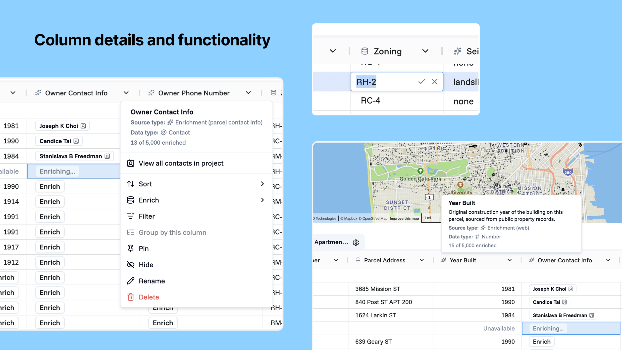
Business problems: Be involved in more of the user's core workflow and keep them living in the platform, which means ensuring users can generate, consume, and edit their data all within MAIA. Improve our own data and feedback on data quality, helping generate a novel user-contributed dataset.
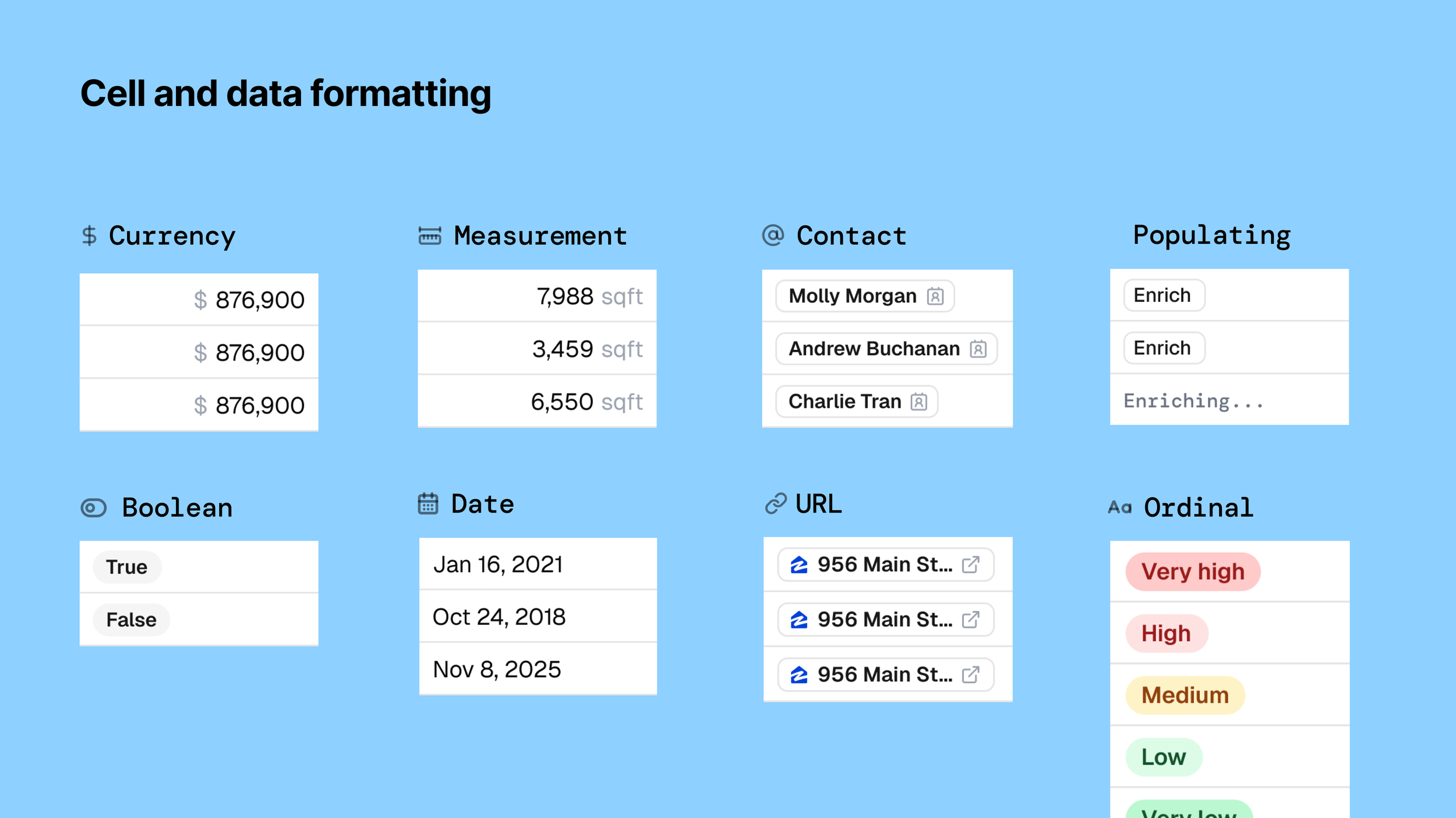
User problems: When a user is working through their data in the table, they need to efficiently scan, interpret, or act on it (looks too much like a raw spreadsheet and it’s easy to lose context). When encountering incorrect enrichment data, I need to correct it so my dataset stays accurate. Users depend on data accuracy to make decisions, and they need to know where the data is coming from, what the agent did to get there, and the general shape of the data is.
Solutions: Data overviews in column headers, source tracing, ability to re-run the data, enrichment progress, agent reasoning, table UI improvements for ease of scanning, ability to edit fields, and favoriting of parcels/buildings/features/rows In short: Scanability, interactivity, and trust signals.
March 2026, Contentsquare (Releasing Summer 2026)
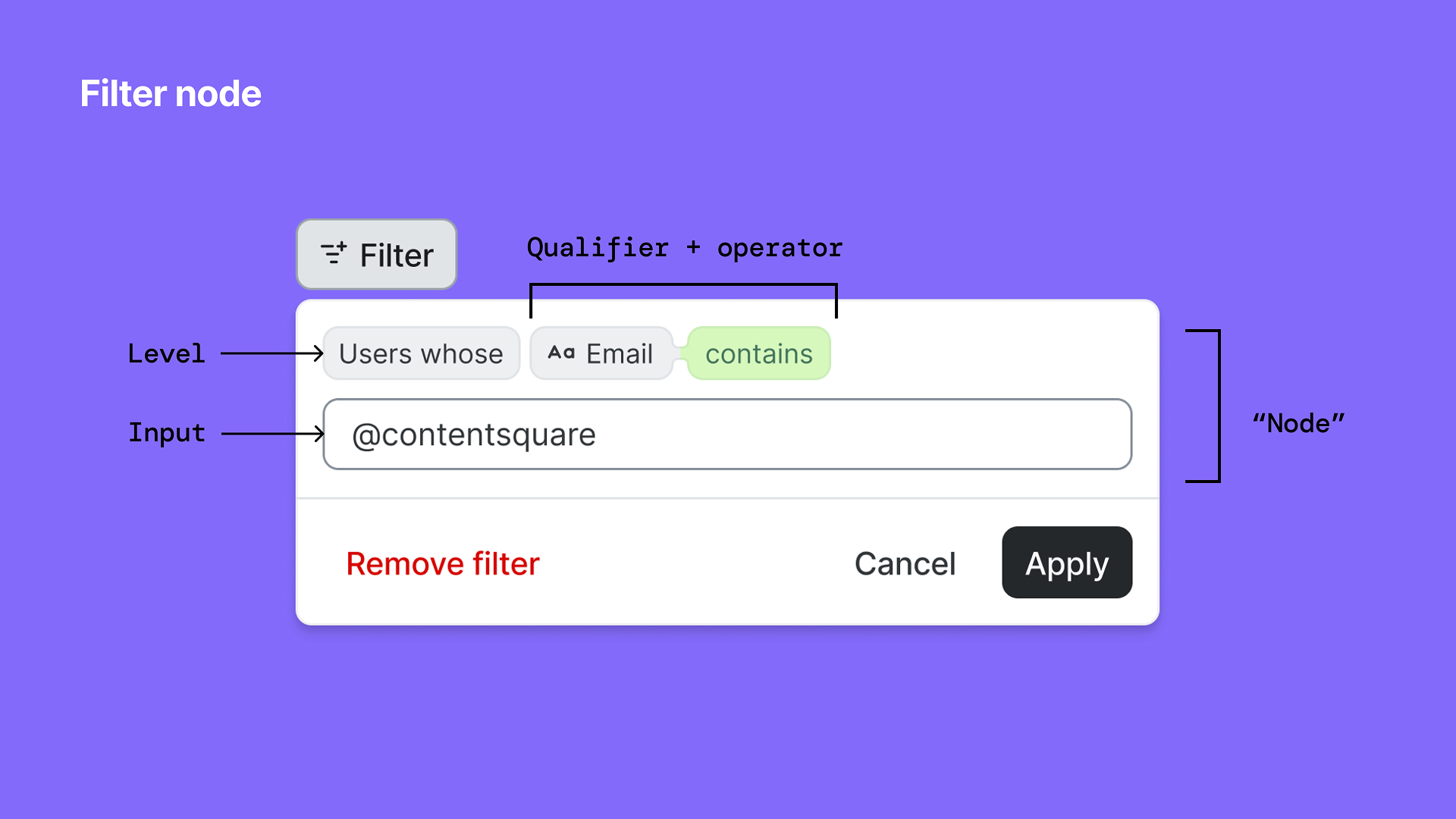
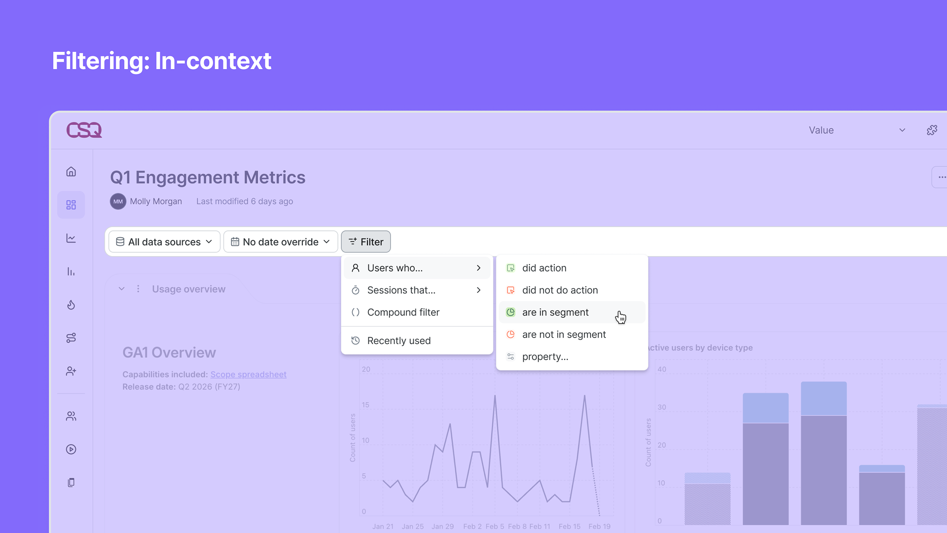
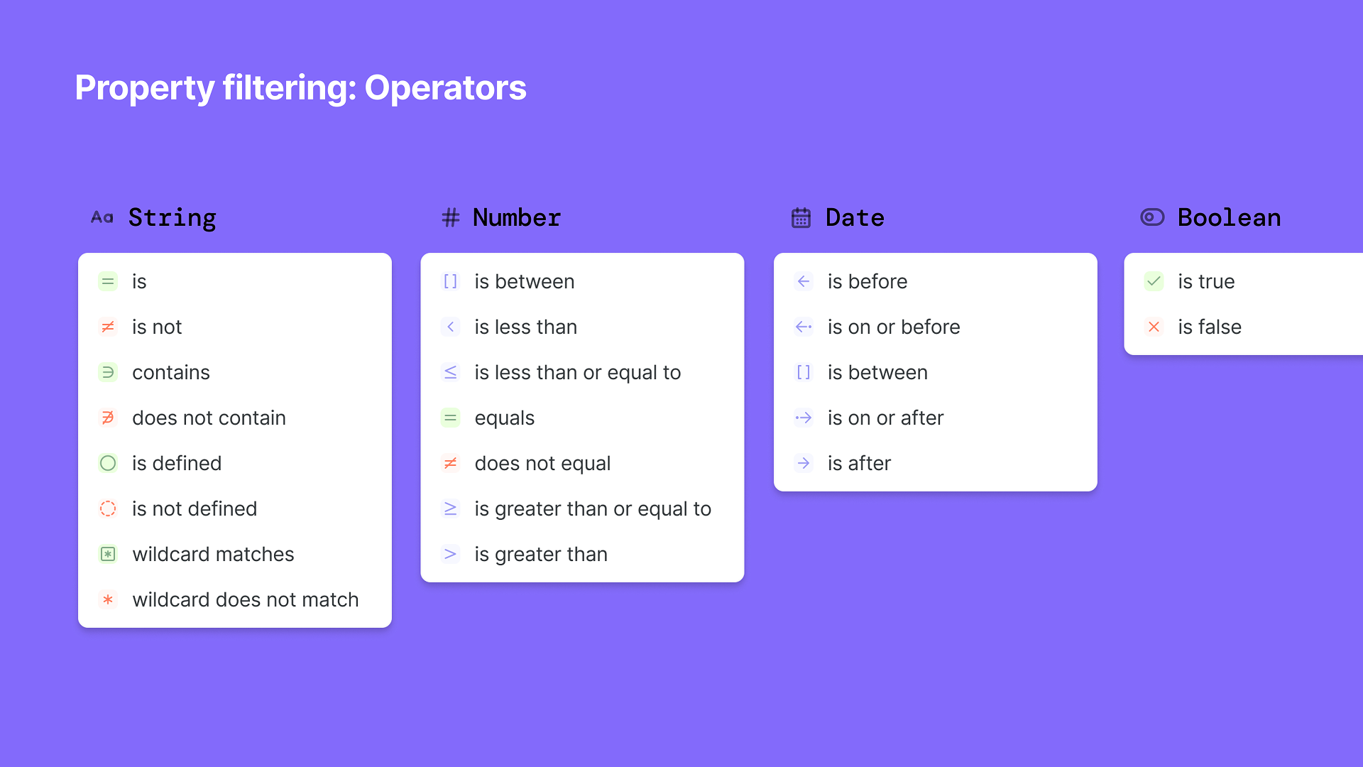
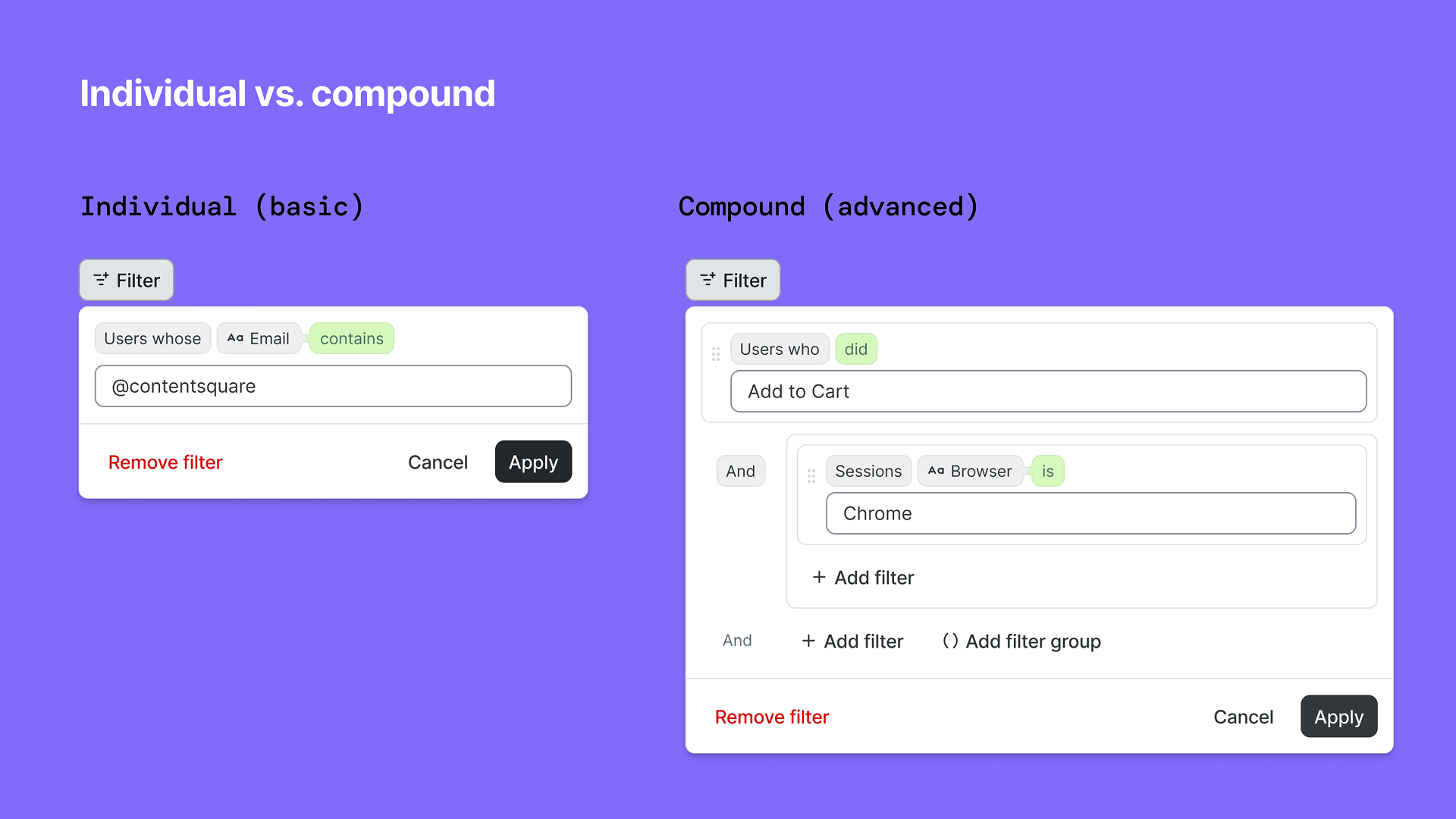
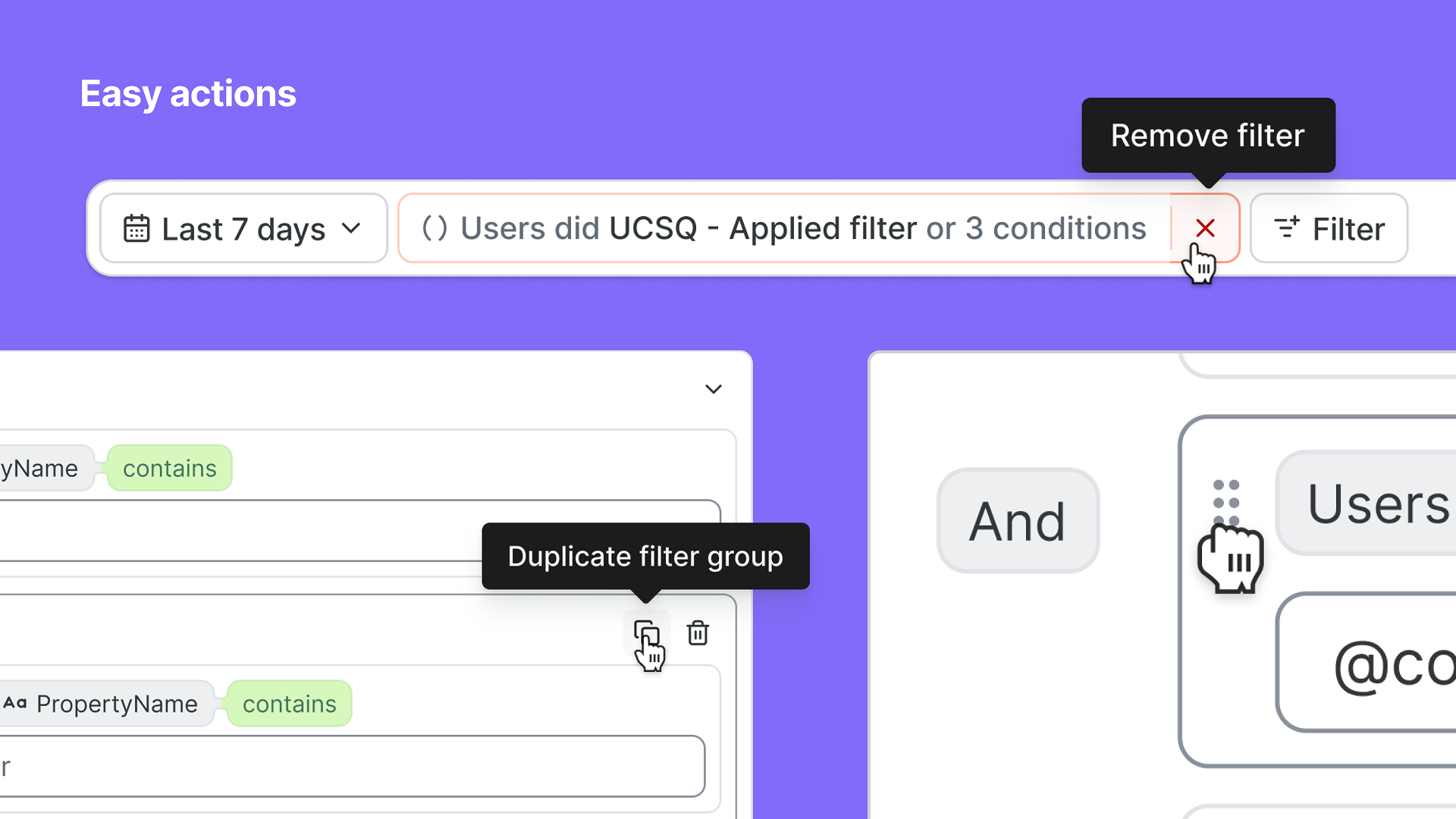
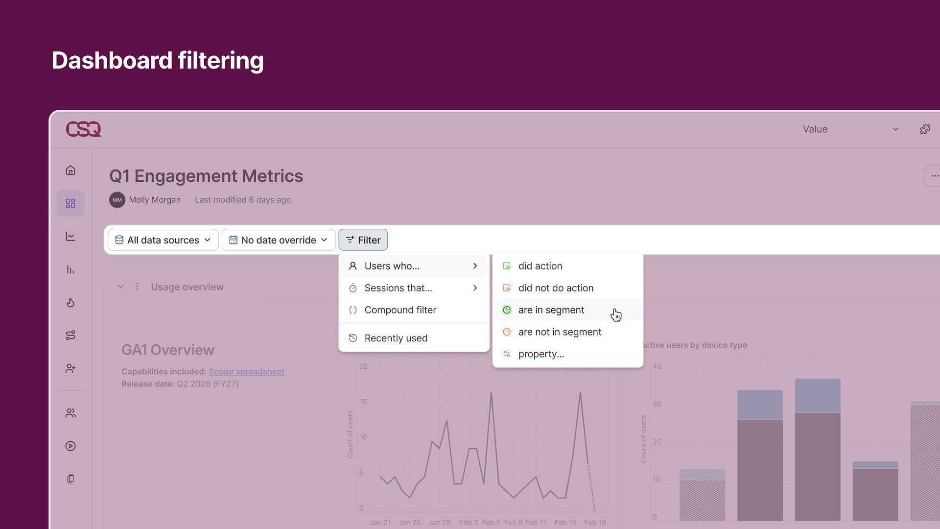
Top-level filtering
Lead designer
Led design for the UX approach and UI implementation of global filtering across a merged application. Key principles: Simple and advanced entry points, consistent experience across surfaces, flexible and responsive to the surface, additive instead of ever-present defaults, support intentional pivots rather than automatic persistence, task continuity so users can pick up where they left off, and guided capabilities that help users get to value faster through helper text, recents, suggested, and context. For both consumer and creator personas, and anyone in between. Goals: Expedite time-to-value across the platform, establish data clarity and trust, and support scaling from simple to complex use cases.
March 2026, Contentsquare (Releasing Summer 2026)
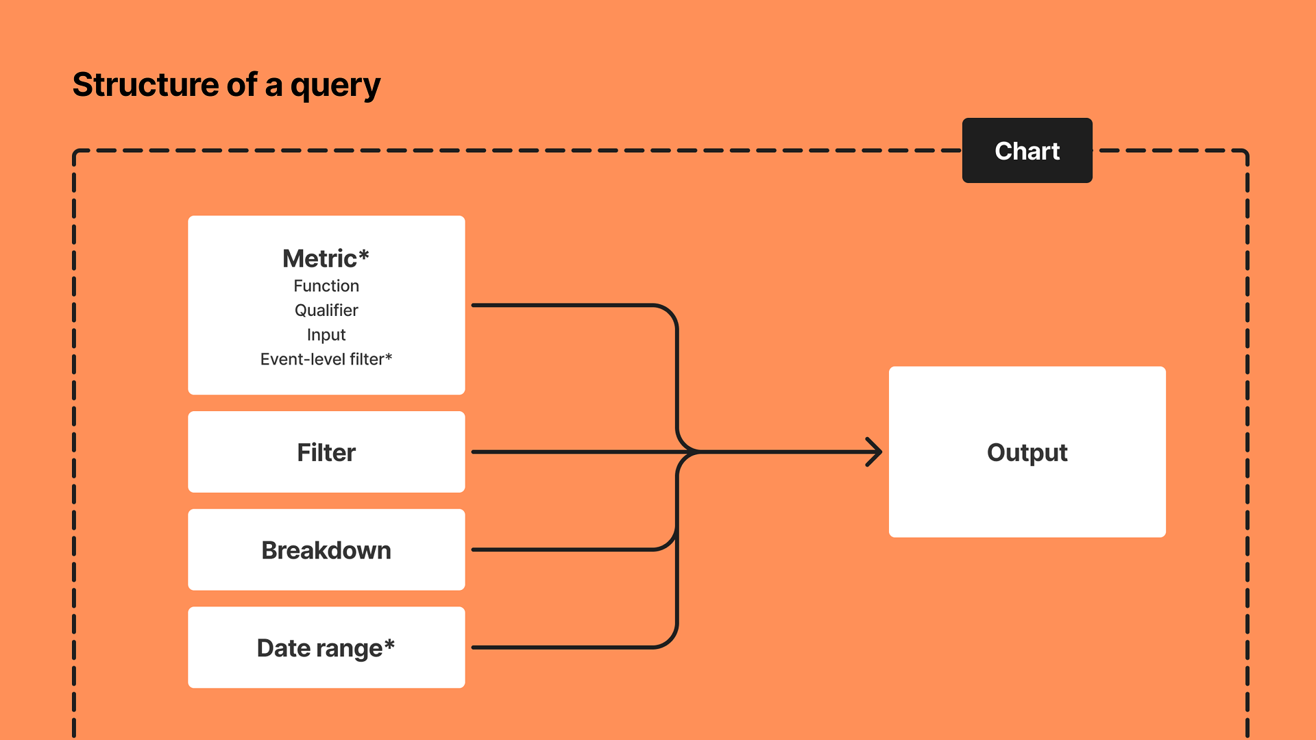
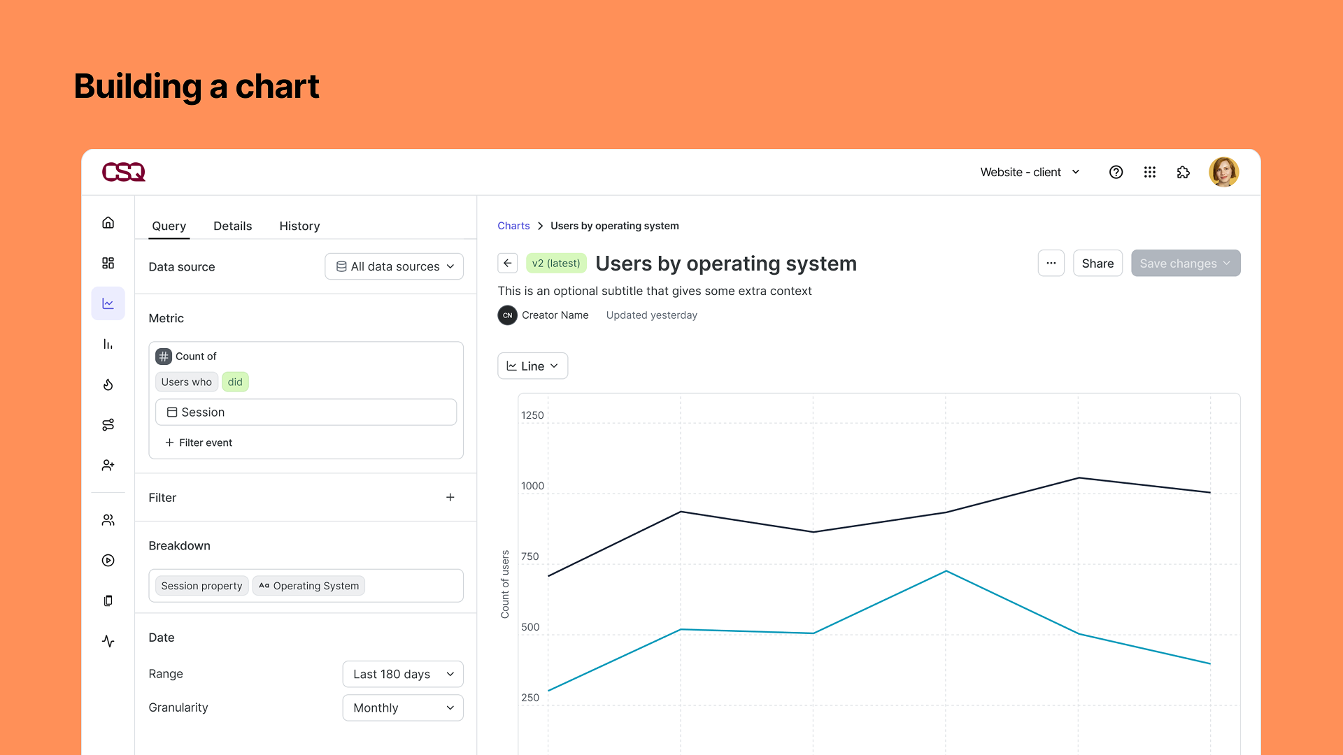
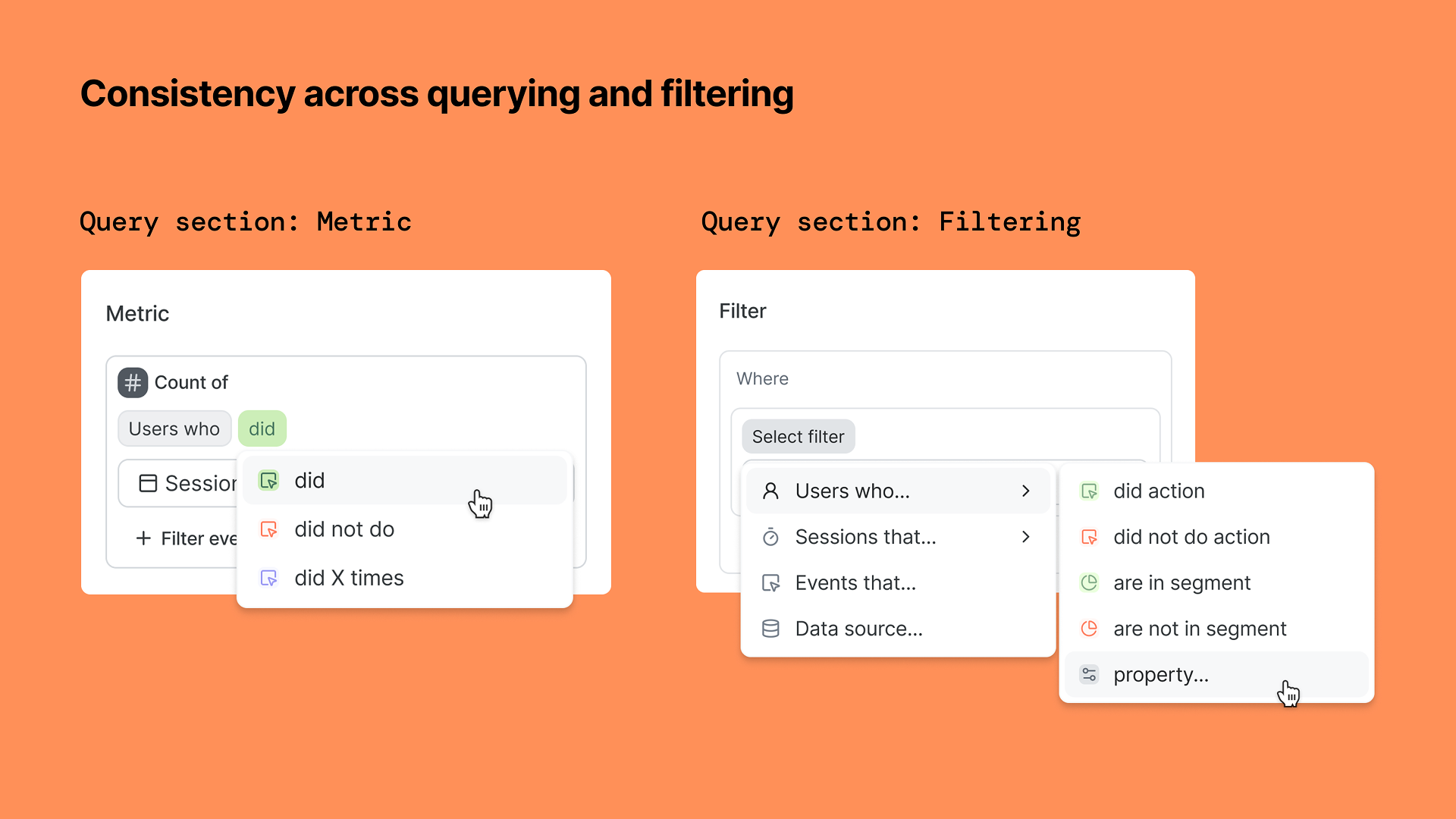
Querying and Chart system
Co-design lead
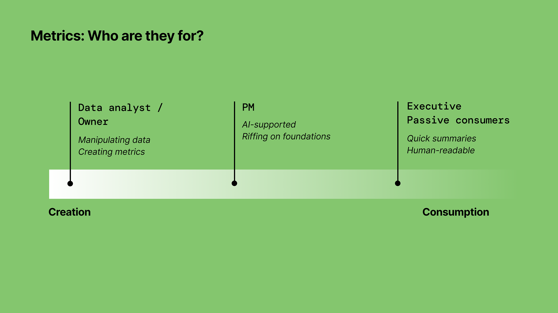
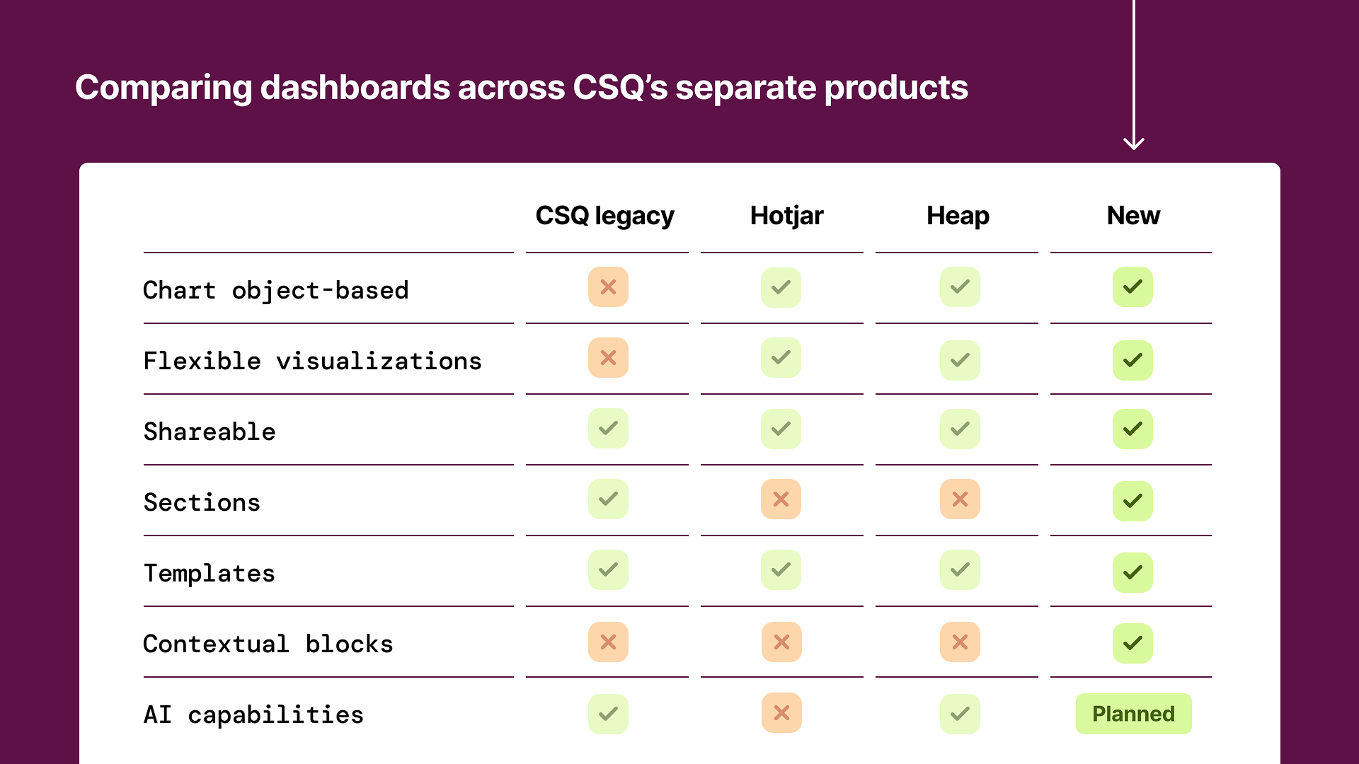
Introduced querying and charting to Contentsquare, merged the data models and capabilities of two platforms (Contentsquare, Heap) in a single experience to give users a complete view of their customer’s lifecycles: across web and mobile, and across different applications and sites. This translated the metrics model (below) into a user experience that can scale to support any kind of quantitative analysis within the product. Key principles: Charts are unified under one, flexible experience; Metrics determine the Chart type; Respect the nested nature of the data model in the UX; Charts are a core, portable object throughout the platform; Underlying structure and resulting visualization are important for future-proofing and use in AI-powered workflows.

August 2025, Contentsquare (Releasing Summer 2026)
Unified platform experience
Co-design lead
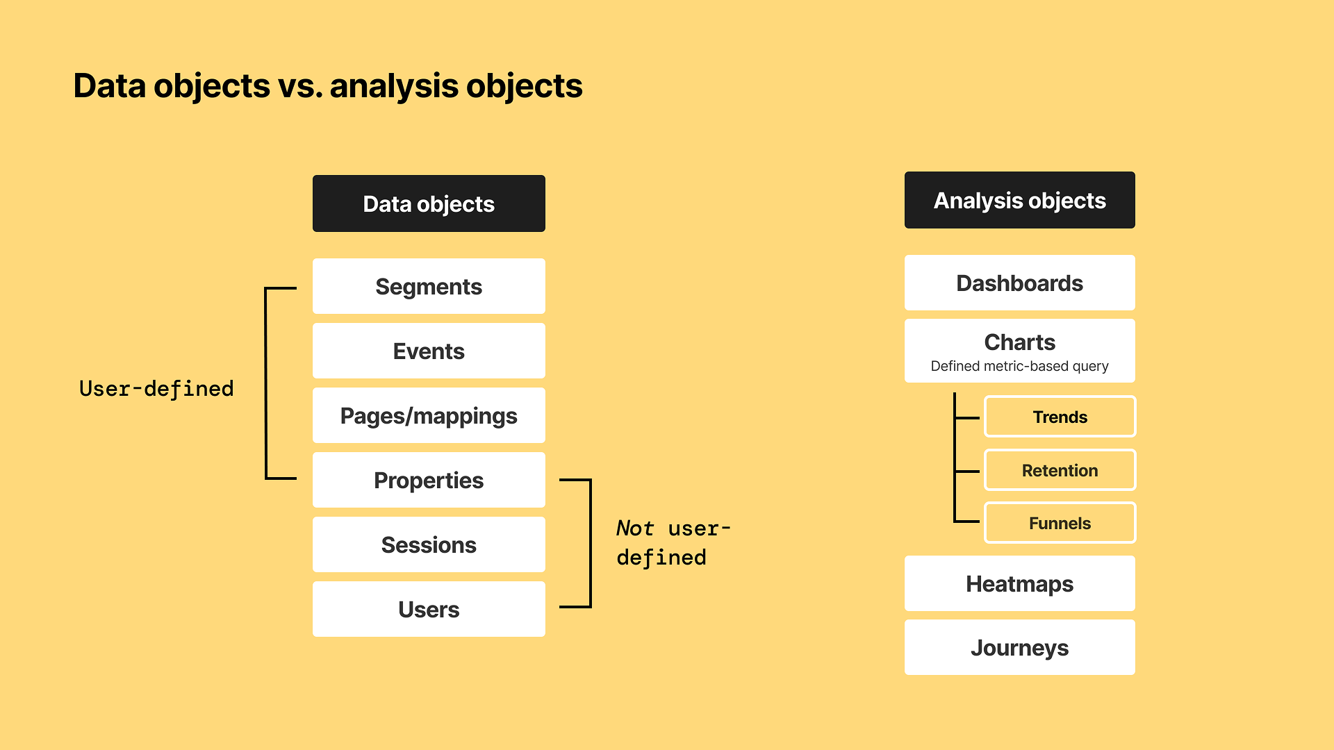
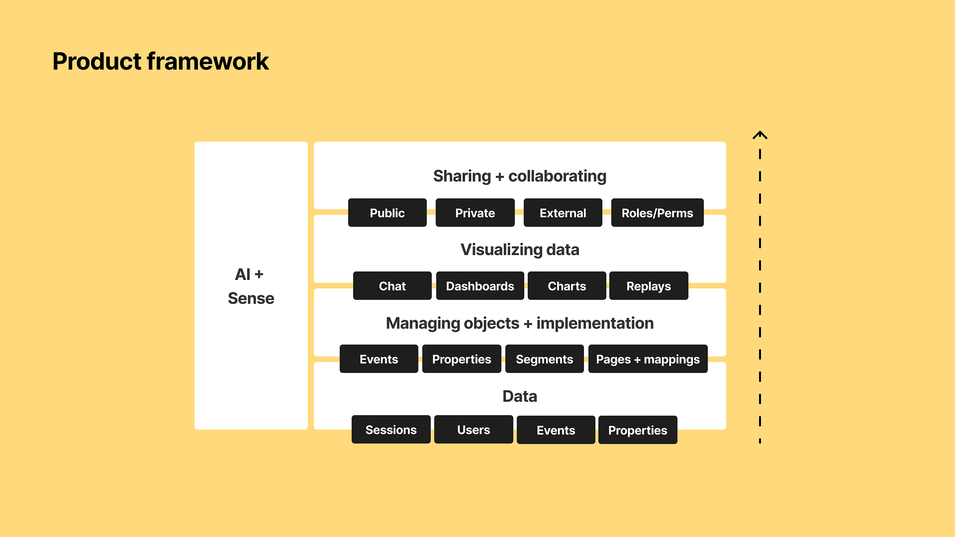
Together with a fellow staff designer led the experience for a new approach to analysis in a unified platform. This approach was a paradigm shift in the way Contentsquare had approached analysis, moving away from bespoke singular-purpose-built modules towards flexible, object-based analysis. Together we worked on translating the data model into a metrics model, how existing capabilities could map to a more connected system of data objects and analysis objects, and how a we could bridge together capabilities (not features) of multiple separate platforms. This influenced direction and scope of our company’s year-long initiative (launching summer 2026). Key principles: Portability of data objects and analysis objects; ability to pivot around any data level (users, sessions, pages, events) or data point; Move towards slimmed down set of “features” that are more robust and can handle varying types of use cases, rather than module-per-use-case; Give users context and clarity as they are consuming or analyzing, rather than trying to obscure complexity. Goal: An “end-to-end” vision of what a merged platform could, across near-, mid-, and longer-term milestones.
April 2025, Contentsquare
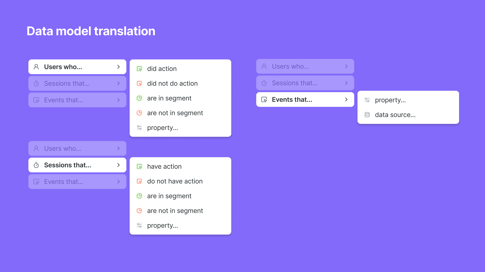
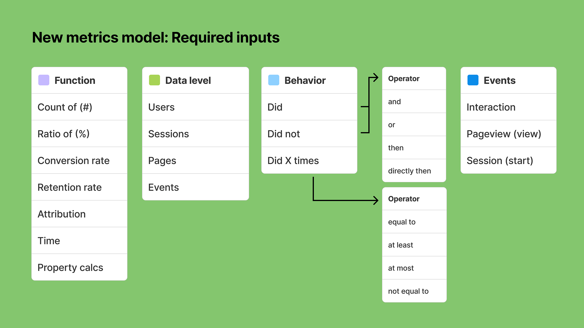
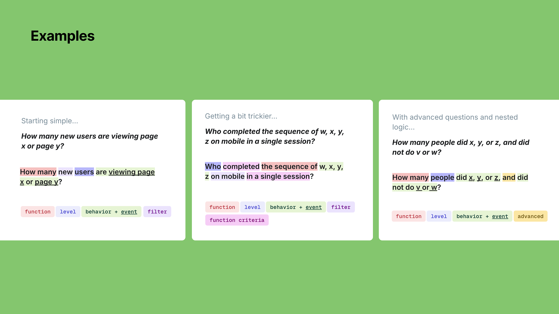
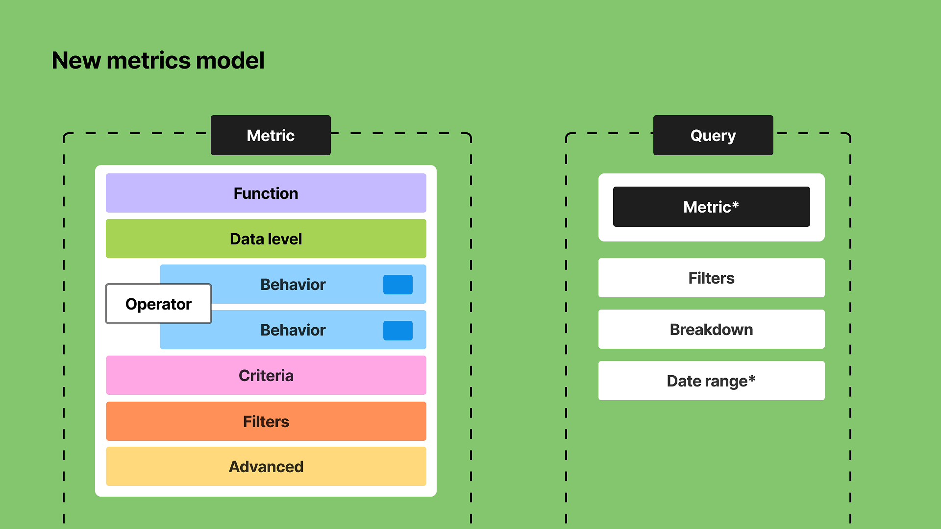
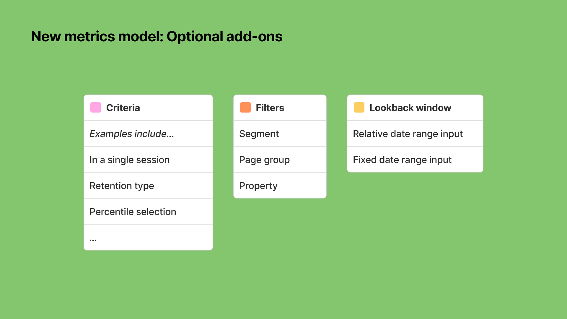
Metrics model
Co-design lead
Created a model for metrics that serves as the basis of querying. Translates the underlying data model into a scalable pattern with strict (clear) definitions of the components of a metric. Key principles: Metrics should be “special” objects with a strict definition. Goal: Ensure we can map back the quantitative analysis capabilities from Heap, Contentsquare, and Hotjar to a metrics model and querying system.
January 2026, Contentsquare (Releasing Summer 2026)
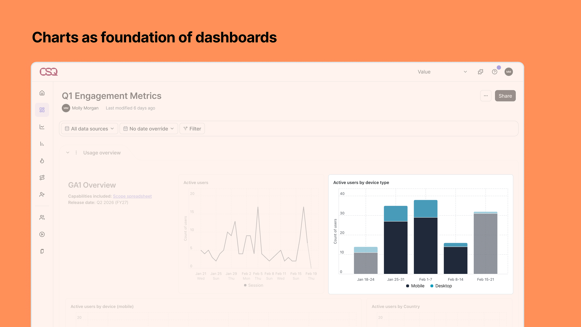
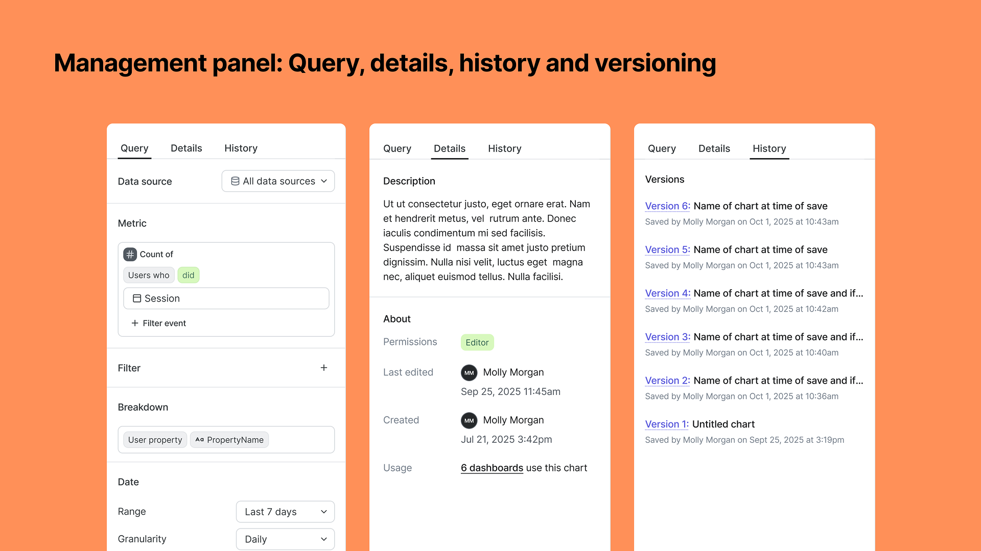
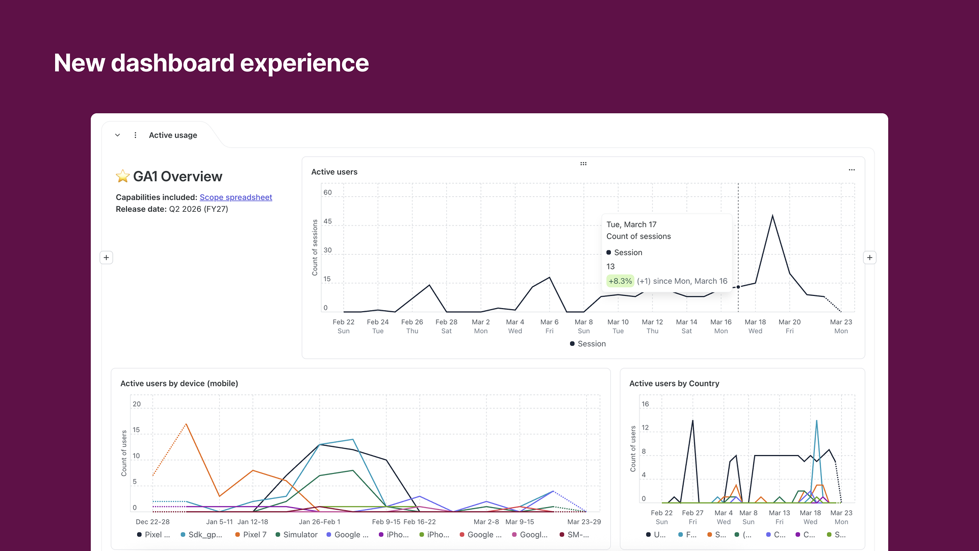
New dashboard experience
Sole designer
Designed a new dashboard experience from the grid system up, tying together metrics, querying, data visualization, and filtering. Key principles: Dashboards should be a launching point for further analysis; Users should be able to spend less time building dashboards and more time with the data; Shareable at every level; Easy landing place for newer users, consumer-only, or riffers; Allow for and provide context; and they should be trustworthy and transparent. These principles translated into the following capabilities and features: Chart-based so users can dig deeper into an analysis or use a single analysis on multiple boards; row-based dynamic grid that automatically handles your layout; shareable dashboard, section, and block links to directly share with colleagues; templates for dashboards, sections, and charts that also include text-block explanations; and more.
November 2025, Contentsquare
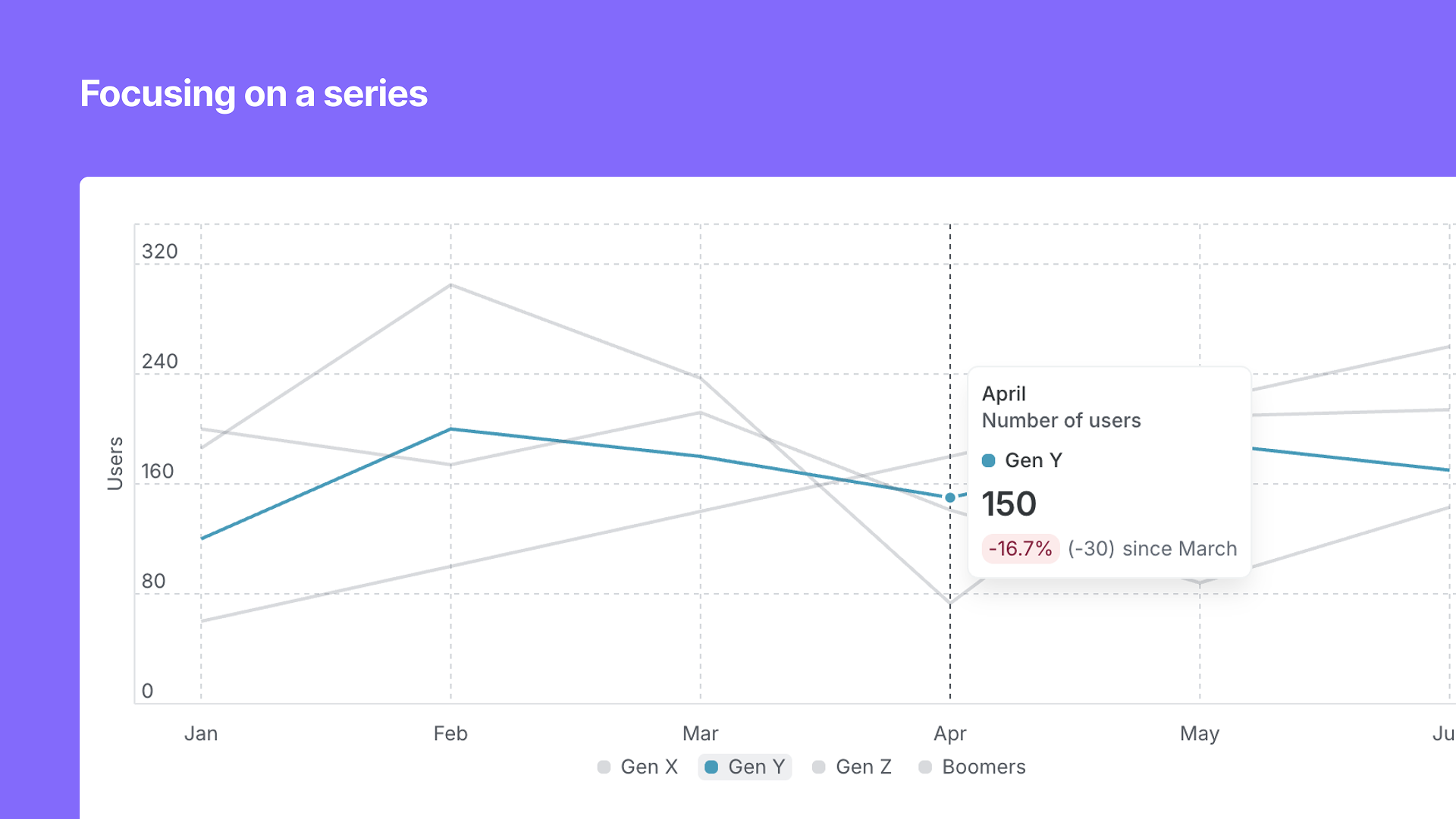
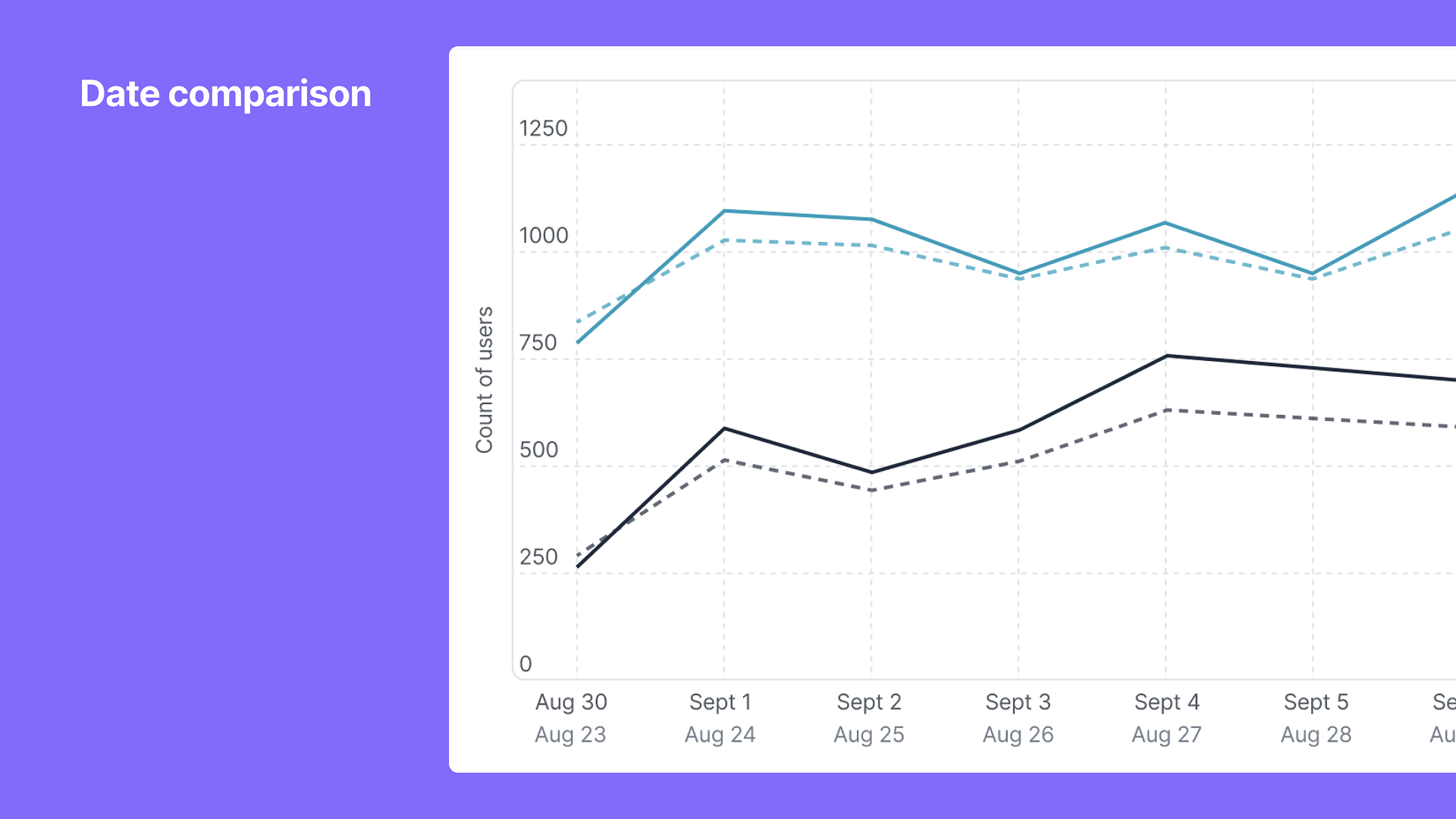
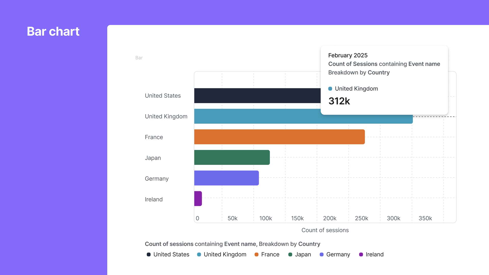
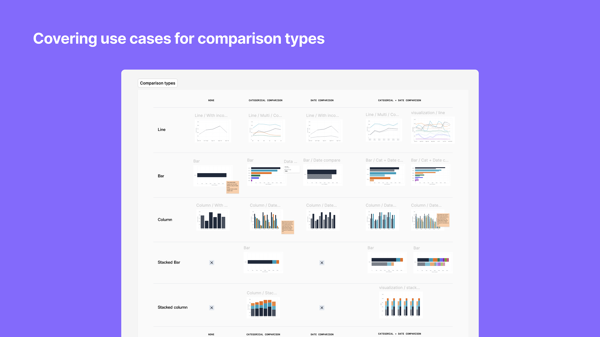
Data visualization library
Sole designer
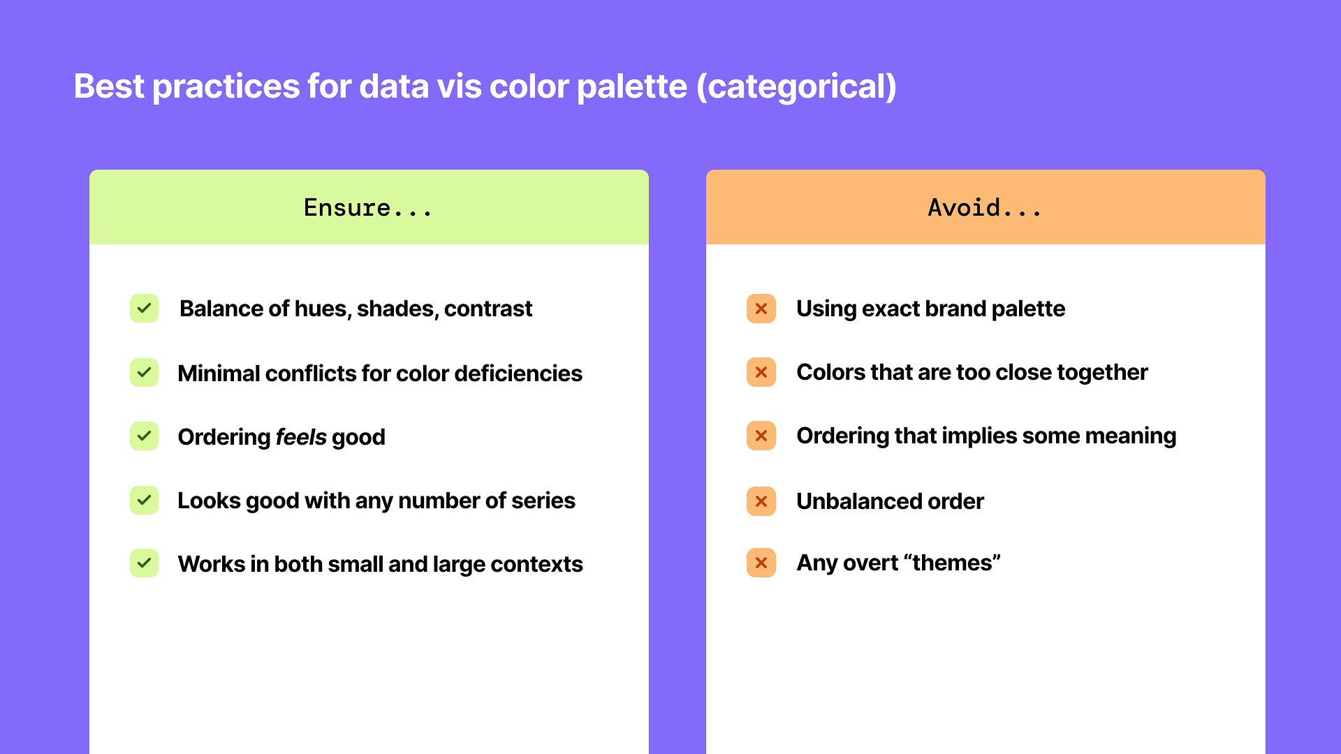
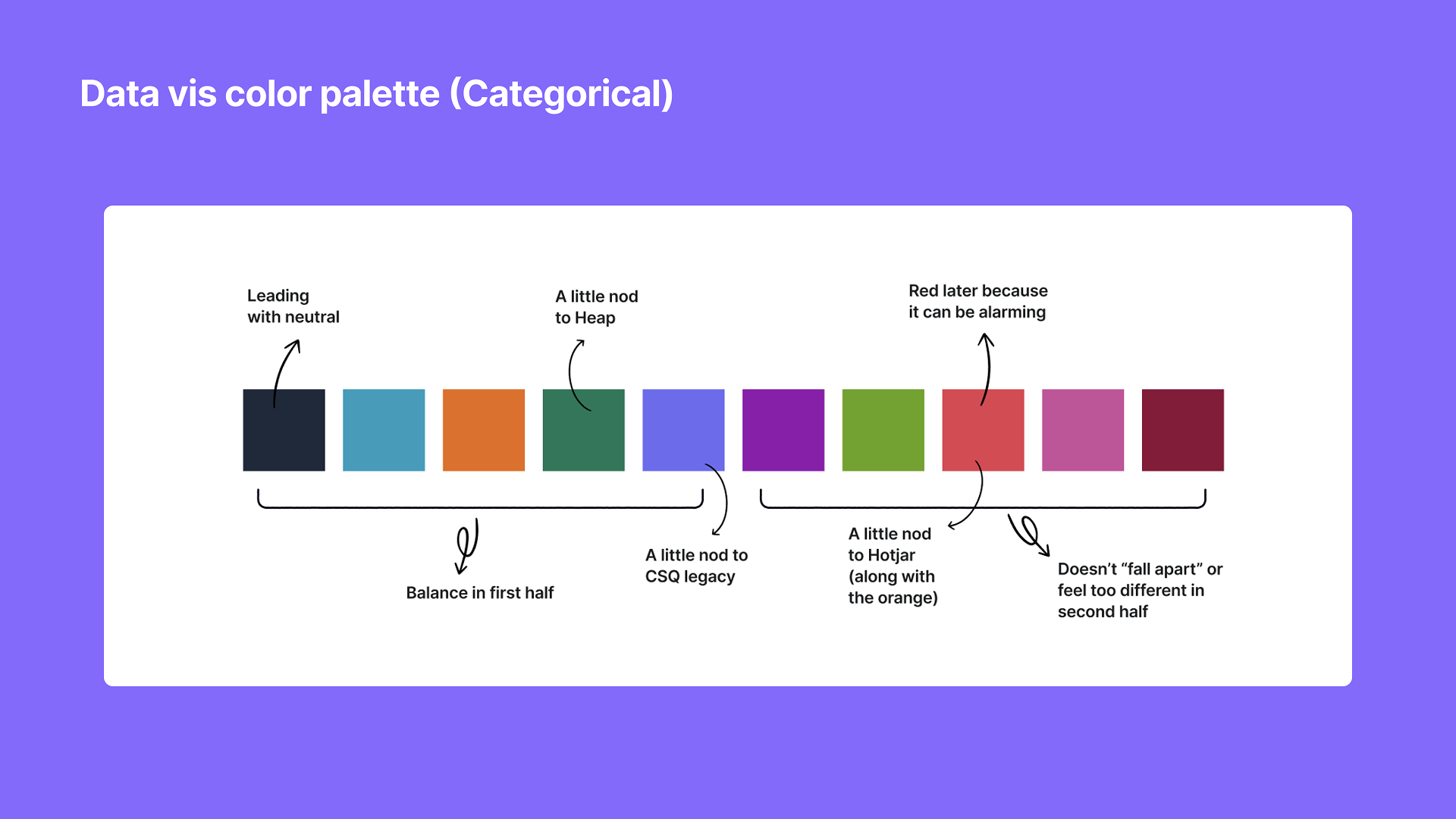
Created a new data visualization library for a unified product, including line charts, bar charts, stacked bars, and grouped bars. Built in best practices for tooltips, trending information (relative vs. absolute change), comparisons, incomplete periods, and axis increments and labeling. Ability to focus in on a single or multiple data points while retaining context. Also, created an updated color palette for data visualizations that brings together best practices and brand nods to the merging brands (Contentsquare, Heap, Hotjar). A big thank you Lisa Charlotte Muth, an expert in this area whose writings and resources helped greatly with this effort.