WEB DESIGN
How I Pendo microsite
Pendo is software that helps people adopt software more quickly and successfully, using analytics, in-app guides, and feedback. The goal of How I Pendo is to showcase customers’ unique, creative, and innovative uses of the Pendo product, to serve as an inspiration and a guide for our customers. The microsite will be an ever-growing repository of customer use cases of Pendo’s guides, analytics, and feedback products, with video content, quotes, and product shots. It increases the amount of available evergreen and video content, and celebrates personas beyond the product manager (the typical focus).
Created for Pendo, 2022
Showcasing the interesting and creative ways Pendo software is used
Brief
The marketing department needed a way to increase the amount of self-serve video content and use cases, for personas beyond the Product Manager. Instead of telling customers what Pendo can do, we needed to show them – with screenshots and interviews directly from other Pendo users.
Objective
The goals for the project were to create place where customers can find guidance and inspiration directly from other customers; to increase the amount of video content we offer; to have a scalable site that can accommodate a growing number of stories and categories; to establish patterns for our website based on our newly refreshed visual identity; and to be able to easily pull content for other channels (blog, social, paid ads, sales, etc.).
Process
I was the only designer working on the project, collaborating with two writers, two developers. The project lasted four weeks from kick-off to a live site. This tight timeline included the interviews, story writing, video editing, site design, and site development. It all had to happen in parallel. We met twice weekly for status updates and to discuss goals, wireframes and iterations, dev constraints, and strategy. Because we had a very clear idea of structure and a tight timeframe, I began with mid-fidelity wireframes.
Considerations
The microsite needed to be easily navigable, show immediate value, and be scalable. We asked the following: How do we surface information up front so a user can truly self-serve relevant stories? How to we account for stories with no video, just product shots? How do we encourage submissions? How do we account for anonymous stories and multi-author stories? How can we drive adoption of Pendo Free? How do we use our refreshed brand identity and use this as a testing grounds for it? How do we create a repeatable pattern for social content?
A bird’s-eye view of the project scope
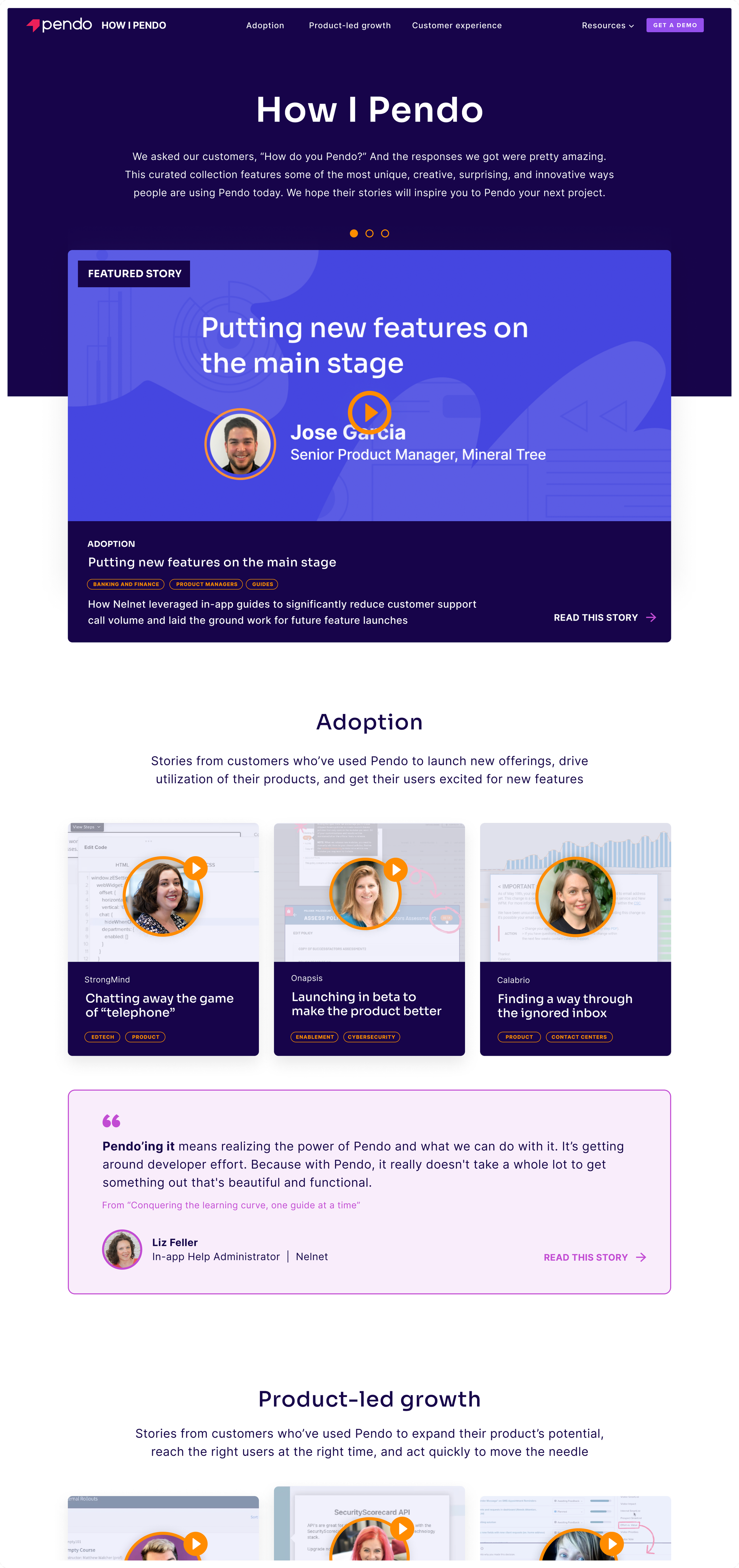

Home to videos, categories, and quotes

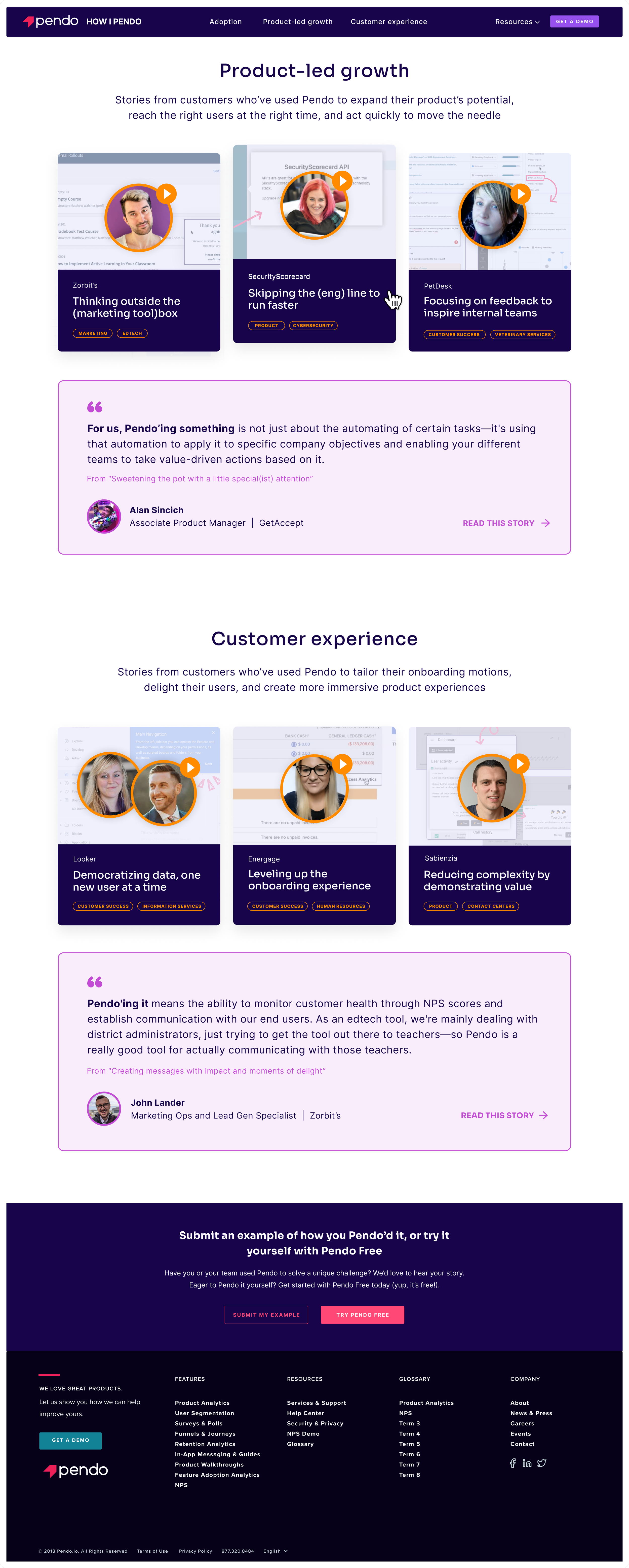
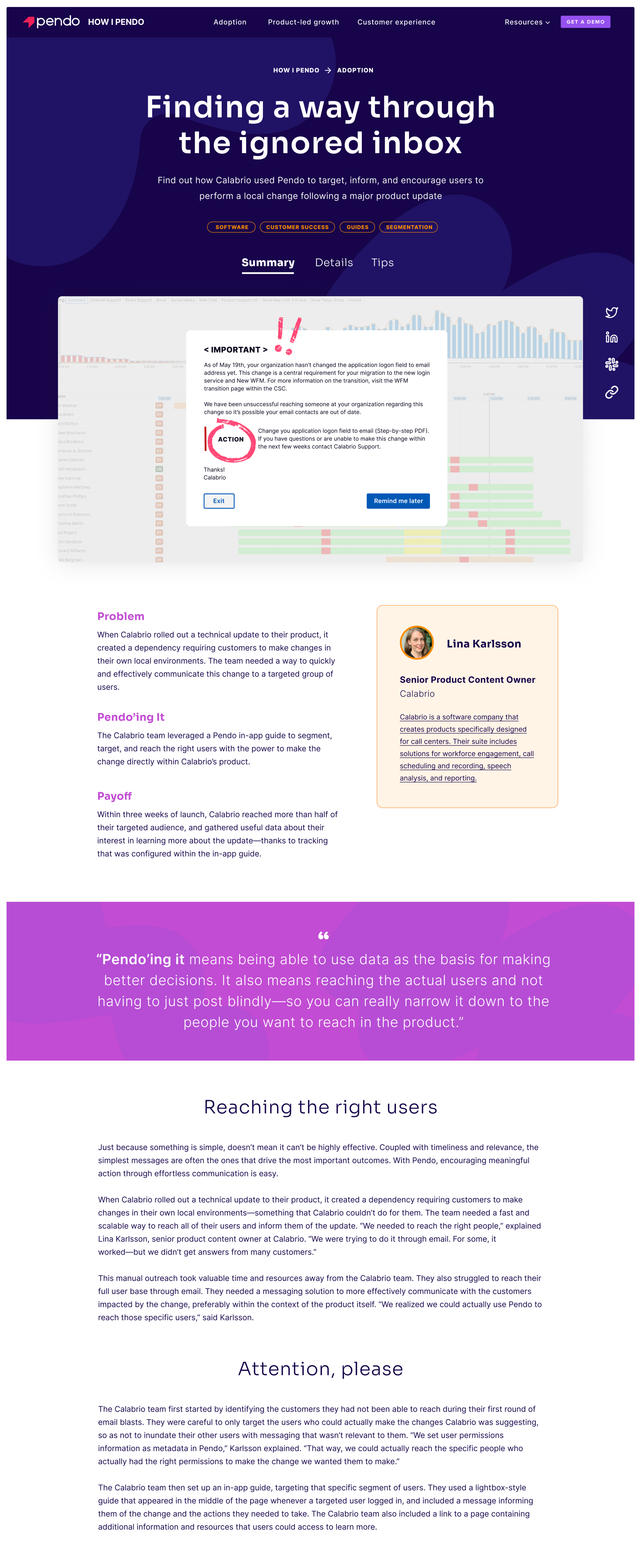
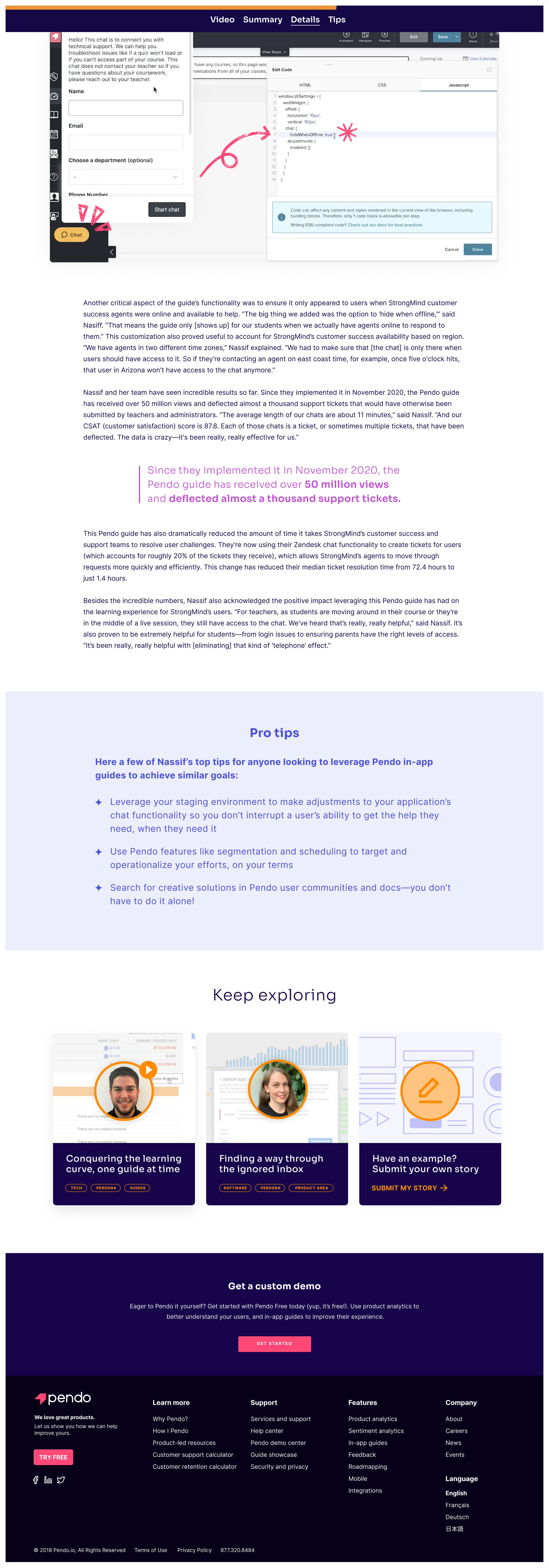
Story pages for both video and non-video



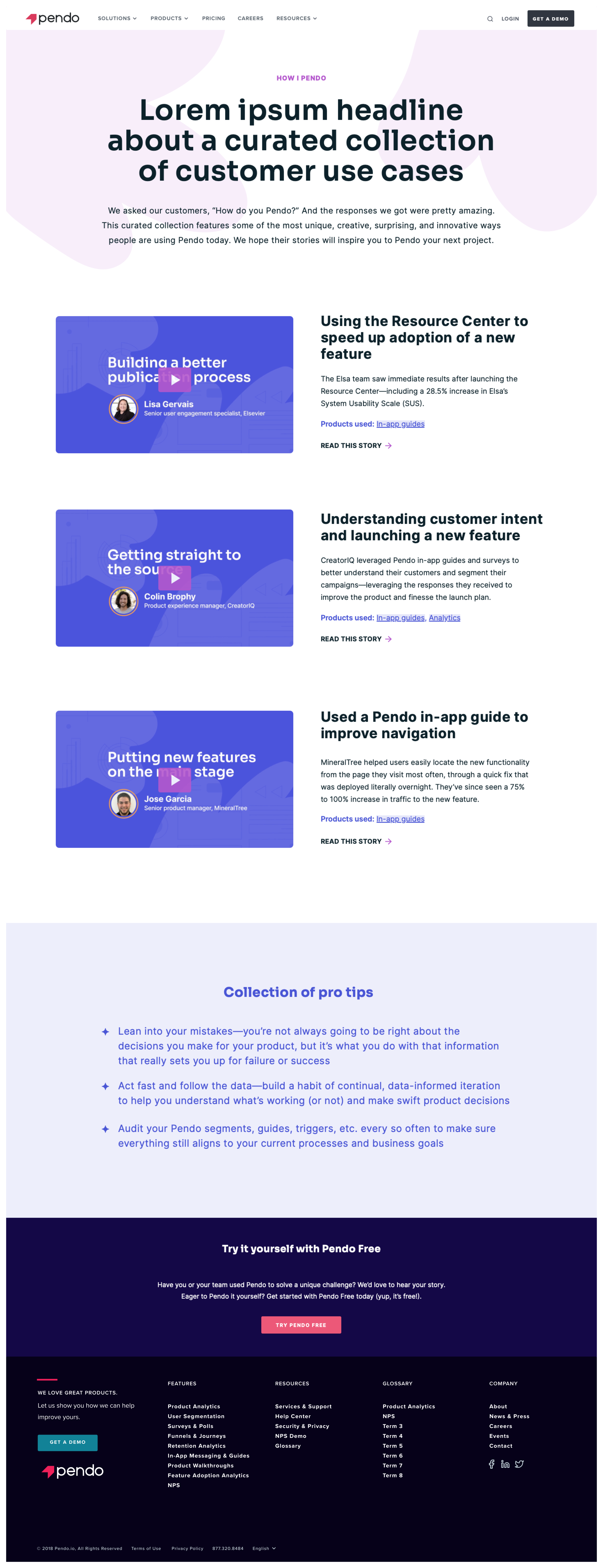
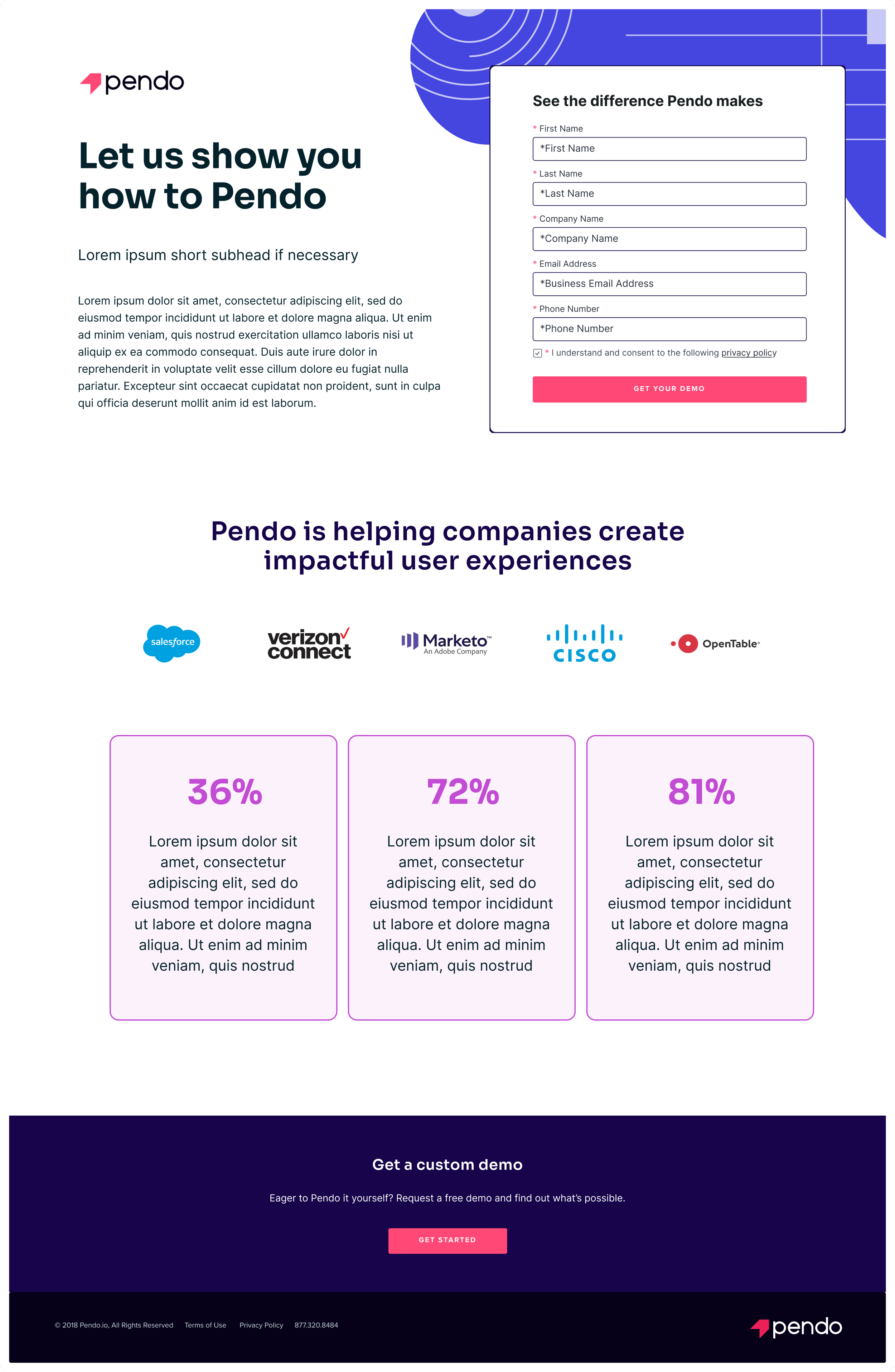
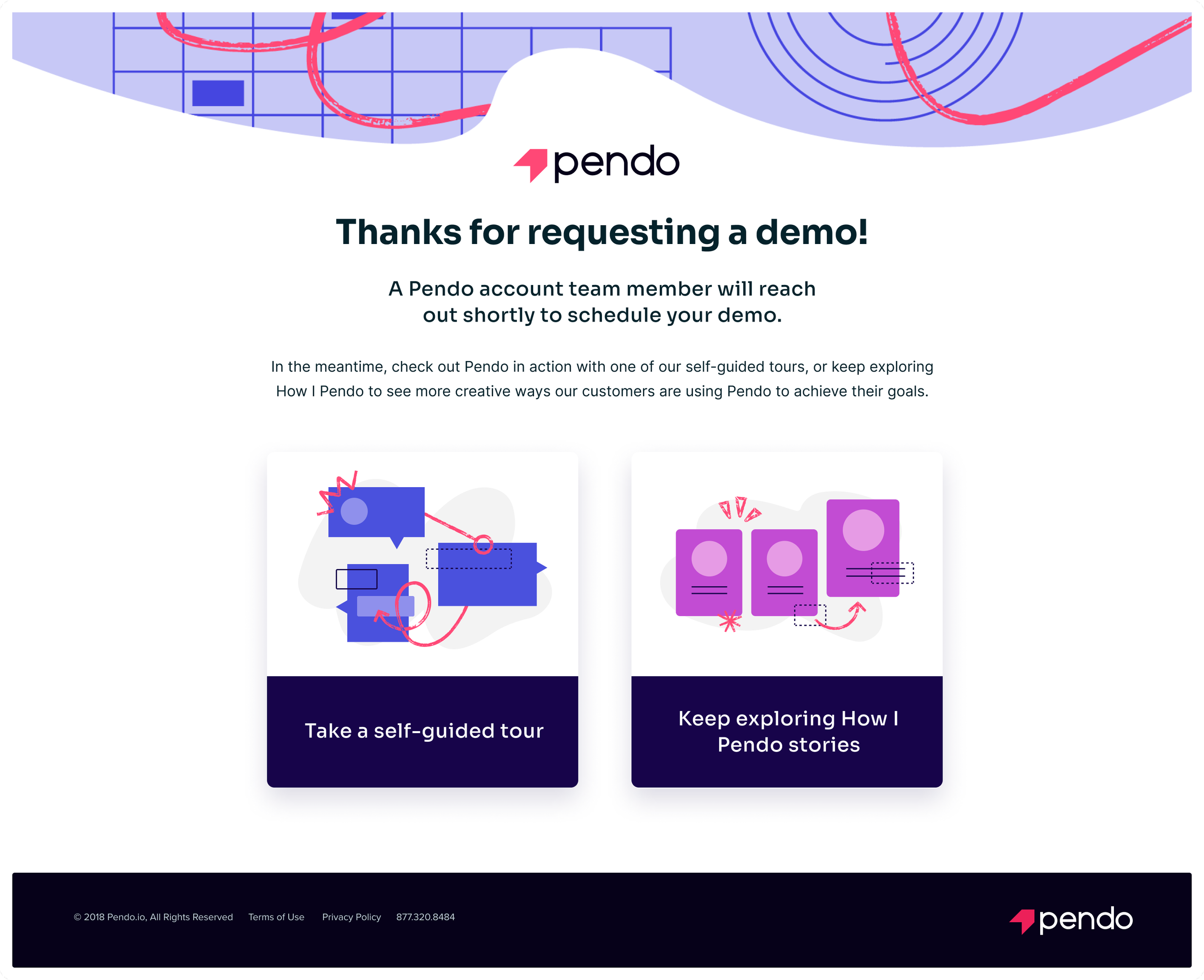
Additional pages for demo requests and curated video lists


This project was loads of fun to work on
I was energized by the quick turnaround, my colleagues’ creativity, and brilliant copywriters
Constraints
Biggest constraint? Time. As a project team, we had to make quick decisions but also set ourselves up for success when future iterations were made. After launch, we continued to meet weekly to discuss incremental improvements and additions to the site, including how we could continue promoting it on the main Pendo site.
Wishes
A list of items and interactions had to be cut from the MVP, given time and dev constraints. While many solutions were ideal and possible, we tabled them for later. Here’s the short list:
Not make the featured video on the home page take up so much room, in order to show more content and value on page load
Create more category pages, and make them a bit more fleshed out
Make the pill tags clickable, so that they act as filters
Create short versions of videos for social media and targeted in-app guides
A stats section on story pages, highlighting quantifiable outcomes and impacts